

There are numerous trading strategies that employ technical analysis, candlestick patterns, arbitrage, and even Artificial Intelligence (AI). Some of these strategies are exceedingly advanced and complex. Currently, Artificial Intelligence is highly popular, and the notion of using it as a miraculous solution for profitable trading is somewhat exaggerated. The majority of trading strategies that have been evaluated and backtested operate on the principle that success is achieved when gains outnumber losses. I believe that the most reliable strategy is, in fact, the simplest one. Employing moving average crossovers in the correct manner can significantly enhance the likelihood of success. I intend to explain their successful trading strategy, and it is anticipated that upon understanding how it functions, one might be surprised by its simplicity.
Quick jump:
The Basics – Moving Averages
Before proceeding, it is essential to grasp the fundamentals of a simple moving average (SMA) in trading. Trading data is typically supplied by trading exchanges and data APIs, such as EODHD APIs, in various resolutions. For instance, data might be presented in the form of daily candles. A candle represents a data point encompassing OHLCV (Open, High, Low, Close, and Volume) information. If one were to plot the closing price of a stock, it would be observed that the resulting line appears “choppy”, which is not particularly helpful. The objective is to calculate a rolling moving average of the closing price to produce a smoother line. For example, we can take the rolling moving average of 50 days, what is commonly referred to as the SMA50.
from eodhd import APIClient
import config as cfg

api = APIClient(cfg.API_KEY)

def get_ohlc_data():
    df = api.get_historical_data("AAPL", "d")
    return df

def calculate_technical_indicators(df):
    df_ta = df.copy()
    df_ta["sma50"] = df_ta["close"].rolling(50, min_periods=0).mean()
    return df_ta

if __name__ == "__main__":
    df_apple = get_ohlc_data()
    df_apple_ta = calculate_technical_indicators(df_apple)
    print(df_apple_ta)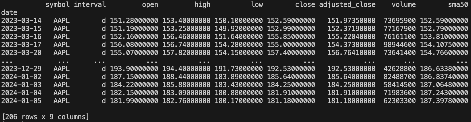
import matplotlib.pyplot as plt
from eodhd import APIClient
import config as cfg

api = APIClient(cfg.API_KEY)

def get_ohlc_data():
    df = api.get_historical_data("AAPL", "d")
    return df

def calculate_technical_indicators(df):
    df_ta = df.copy()
    df_ta["sma50"] = df_ta["close"].rolling(50, min_periods=0).mean()
    return df_ta

if __name__ == "__main__":
    df_apple = get_ohlc_data()
    df_apple_ta = calculate_technical_indicators(df_apple)

    plt.figure(figsize=(30, 10))
    plt.plot(df_apple_ta["close"], color="black", label="Close")
    plt.plot(df_apple_ta["sma50"], color="blue", label="SMA50")
    plt.ylabel("Price")
    plt.xticks(rotation=90)
    plt.title(f"Close vs. SMA50")
    plt.legend()
    plt.show()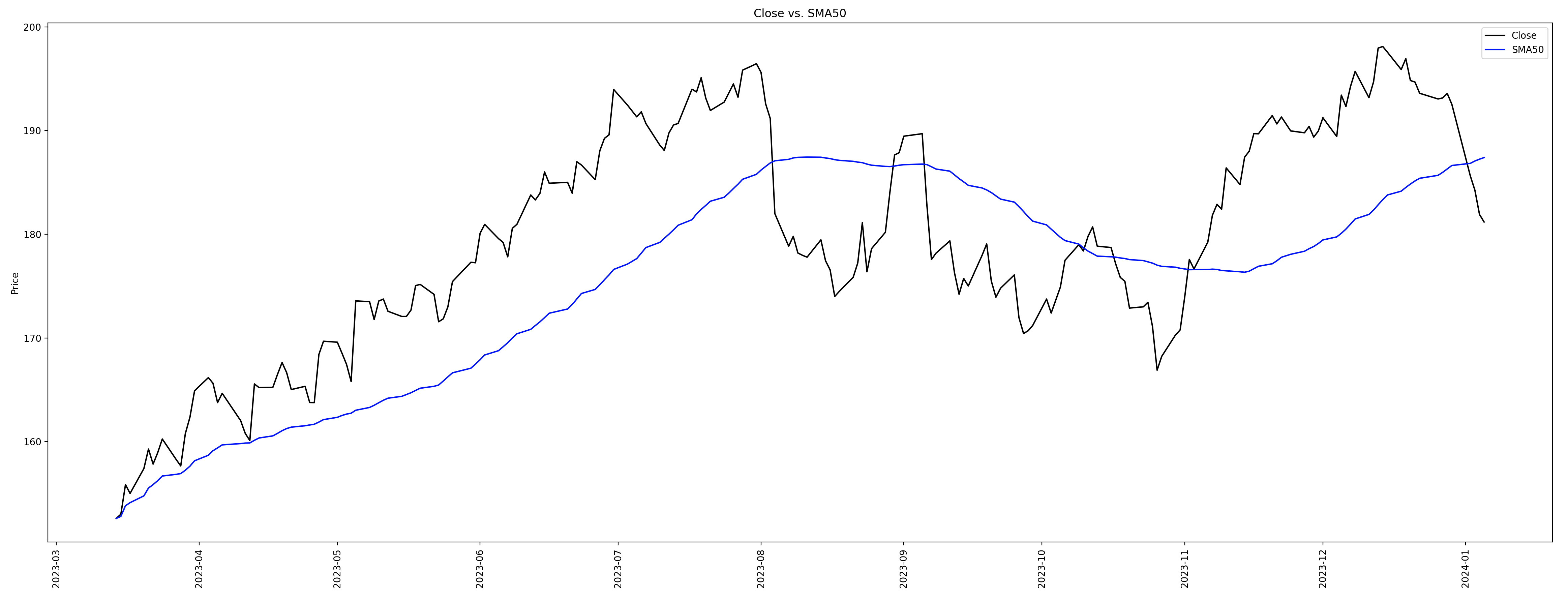
As you can see above, the black line is the closing price looking “choppy”, and the blue line is the smoothed rolling daily average.
Moving Average Crossovers
You may be wondering how the simple moving average helps us on it’s own, and it doesn’t. Where it becomes useful is when you compare two simple moving averages together. For example, the SMA50 and SMA200.
import matplotlib.pyplot as plt
from eodhd import APIClient
import config as cfg

api = APIClient(cfg.API_KEY)

def get_ohlc_data():
    df = api.get_historical_data("AAPL", "d")
    return df

def calculate_technical_indicators(df):
    df_ta = df.copy()
    df_ta["sma50"] = df_ta["close"].rolling(50, min_periods=0).mean()
    df_ta["sma200"] = df_ta["close"].rolling(200, min_periods=0).mean()
    return df_ta

if __name__ == "__main__":
    df_apple = get_ohlc_data()
    df_apple_ta = calculate_technical_indicators(df_apple)

    plt.figure(figsize=(30, 10))
    plt.plot(df_apple_ta["close"], color="black", label="Close")
    plt.plot(df_apple_ta["sma50"], color="blue", label="SMA50")
    plt.plot(df_apple_ta["sma200"], color="green", label="SMA200")
    plt.ylabel("Price")
    plt.xticks(rotation=90)
    plt.title(f"Close vs. SMA50 vs. SMA200")
    plt.legend()
    plt.show()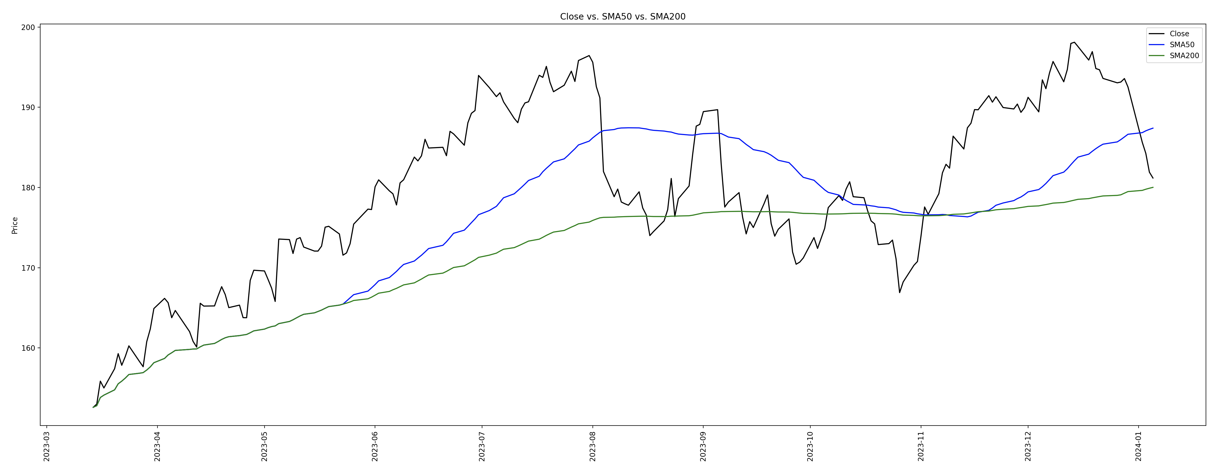
The SMA50 is the blue line above, and the SMA200 is the green line. The blue is the “short-term moving average” and the green is the “long-term moving average“. When you compare the two, it becomes a powerful indication of direction. For example, when the SMA50 (short) is above the SMA200 (long) it indicates the market is on the incline “bull market“, and if the SMA50 (short) is below the SMA200 (long) it indicates the market is on the decline “bear market“. Many traders will actually buy and sell as the lines cross over and this works very well. If you look at the points of crossover and how this affects the closing price you can see it in action.
You can actually compare any “short-term moving average” and “long-term moving average“, but the SMA50 and SMA200 is special. The crossovers are known as the “Golden Cross” going up, and the “Death Cross” going down. I mean the descriptions are self explanatory. There are many other common moving averages used like SMA5, SMA10, SMA20, SMA50, and SMA200.
You may be thinking that you know what moving average crossovers are and there is nothing new here. This is what I would describe as the basic foundation, that is still very effective. Where you take this to the next level is to compare moving average crossovers at different intervals. That’s where it becomes very powerful and almost foolproof.
Multi-Level Moving Average Crossovers
My trading strategy works as follows…
Stage 1: Compare the SMA50 and SMA200 on the weekly
Retrieve the weekly historical trading data. Each row would be one candlestick per week. When you plot the SMA50 and SMA200 and compare the Golden Cross / Death Cross it gives you a powerful long term health of the market. If the SMA50 is above the SMA200, it means the long term trend is up. Do not trade markets where this is in reverse. One “gotcha” here is that some exchanges and data providers won’t provide weekly data, only daily. What you can do using Python Pandas is create your own weekly data using daily data 🙂
import pandas as pd
import matplotlib.pyplot as plt
from eodhd import APIClient
import config as cfg

api = APIClient(cfg.API_KEY)


def get_ohlc_data():
    df = api.get_historical_data("AAPL", "d", results=1000)
    return df


def calculate_technical_indicators(df):
    df_ta = df.copy()
    df_ta["sma50"] = df_ta["close"].rolling(50, min_periods=0).mean()
    df_ta["sma200"] = df_ta["close"].rolling(200, min_periods=0).mean()
    return df_ta


if __name__ == "__main__":
    df_daily = get_ohlc_data()

    df_weekly = df_daily.resample("W").agg(
        {
            "open": "first",
            "high": "max",
            "low": "min",
            "close": "last",
            "adjusted_close": "last",
            "volume": "sum",
        }
    )

    df_weekly["symbol"] = "AAPL"
    df_weekly["interval"] = "w"
    df_weekly = df_weekly[["symbol", "interval", "open", "high", "low", "close", "adjusted_close", "volume"]]

    df_weekly_ta = calculate_technical_indicators(df_weekly)

    print(df_weekly_ta)
I renamed df_apple” to “df_daily” from my code examples above. I then resampled the daily data to weekly. I then added back the “symbol” and “interval” to the aggregate.
Just as a side note… to get 200 weeks of candles you will need 1400 days of candlestick data. That would be 200 x 7 days in the week. If you are using the EODHD APIs Python Library (as above), you can include “results=1400” in the “get_historical_data” function parameters.
The Apple AAPL stock may actually not be the best example as the SMA50 (175.63620000) is below the SMA200 (176.28325000) on the weekly. I personally would not be trading this now as it fails my first trading rule. However, if you want to find an index that has the SMA50 above the SMA200 on the weekly you can look at the S&P 500 (“HSPX.LSE“).
Stage 2: Compare the SMA50 and SMA200 on the daily
Assuming Stage 1 passes, i.e. SMA50 is greater than the SMA200 on the weekly, we can move onto the next stage. We now want to make sure the SMA50 is above the SMA200 on the daily data. If this passes, we can move onto the next stage.
Stage 3: Compare the SMA50 and SMA200 on the hourly
If the SMA50 is greater than the SMA200 on the weekly and daily, the stars are aligning. Now we just need to look for our buy signal. This is when the SMA50 crosses above the SMA200 on the hourly. If this happens you have a triple confirmation which in almost all cases will be a successful trade. You are also able to short the market in reverse. If the SMA50 crosses below the SMA200 on the hourly, you can short sell and profit on the way down as well 🙂
I have also tried this on the minute data instead of hourly data, and it still works with almost 100% success rate! It is a bit more risky using minute data, and wins are smaller, but it still works very well.
How do we know when to sell?
To close a trade we will want to use a form of trailing stop loss. Assuming our order is a buy, as in moving up, we want to reset the stop loss to the low of the previous candle. As the price moves up we reset the stop loss to the low of the previous candle. If the price drops it will automatically sell.
If the order is a sell, as in moving down, we want to do the reverse. As the price moves down, we want to reset the stop loss to the high of the previous candle. As the price drops the stop loss will be reset so when the market turns it will automatically sell.
Conclusion
This in my opinion is one of the most effective trading strategies around and has an extremely high success rate. From my experience and years of evaluating trading strategies and backtesting them, the most effective strategies are often the ones that are the least complex.
One mistake I’ve seen time and time again are traders creating these ultra unique and complex strategies, but if they are that unique you will not be following the masses. You ideally want to be buying when the majority of people are buying, and selling while other people are selling. You just want to react as quickly as possible and not leave it too late.