Please note, API data availability depends on your subscription plan. Some data isn’t included in the free plan. Visit our pricing page to find the package that fits your needs.
This article builds upon the previous two in the series, “Build a Financial Trading Dashboard with Python Django” and “Enhancing the Financial Trading Dashboard with Python Django”.
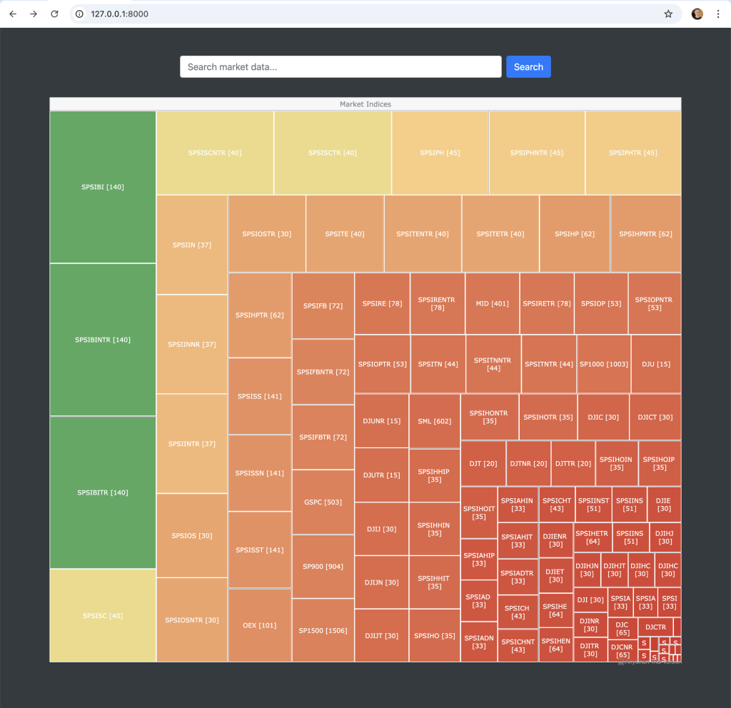
Initially, I created the treemap on the landing page using the D3.js library. While it worked well, I wanted to explore other charting options, so I evaluated both Chart.js and AnyChart. Ultimately, I decided to migrate the treemap from D3.js to AnyChart. Although the visual appearance of the charts is quite similar, I found AnyChart’s code significantly more intuitive and easier to understand. Additionally, I personally feel that the AnyChart treemap offers slightly more functionality and appears more polished. That said, I also liked the aesthetic of Chart.js, which remains a viable option.
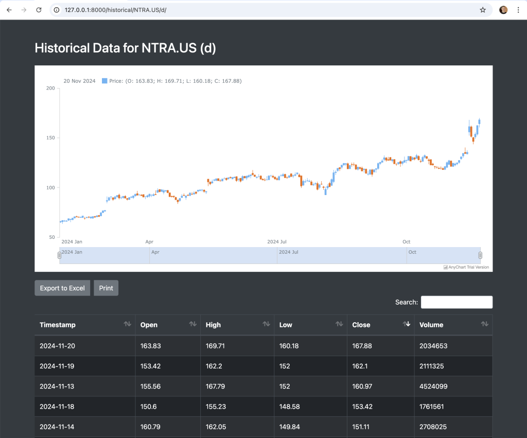
In the previous article, I created a page displaying the historical data of a market, presented neatly using a Bootstrap data table. For this article, I wanted to include an appealing stock chart above the table. Once again, I considered the three charting libraries, but I was particularly impressed with the way AnyChart presented the data and the functionality it offered. This article will explain how this was achieved.

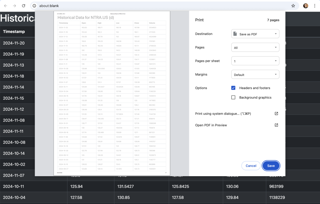
Finally, I discovered another useful feature available in Bootstrap. In the previous article, I demonstrated how to add an “Export to Excel” button. Similarly, with just one line of code, you can also add a “Print” button. This feature takes the data from the Bootstrap table and presents it in a print-friendly format.

Quick jump:
Updating the View
I only had to make one change to a view to get the historical data stock chart working.
def fetch_historical_data(request, market, interval):
    now = datetime.now()

    if interval in ["m", "w", "d"]:
        end_date = now.date().isoformat()
        start_date = (now - timedelta(days=300)).date().isoformat()
    else:
        end_date = now.strftime("%Y-%m-%dT%H:%M")
        start_date = (now - timedelta(hours=300)).strftime("%Y-%m-%dT%H:%M")

    start_date = request.GET.get("from", start_date)
    end_date = request.GET.get("to", end_date)

    def parse_datetime(dt_str):
        try:
            return datetime.strptime(dt_str, "%Y-%m-%dT%H:%M:%S")
        except ValueError:
            try:
                return datetime.strptime(dt_str, "%Y-%m-%dT%H:%M")
            except ValueError:
                return datetime.strptime(dt_str, "%Y-%m-%d")

    start_date_parsed = parse_datetime(start_date)
    end_date_parsed = parse_datetime(end_date)

    if interval in ["m", "w", "d"]:
        start_date = start_date_parsed.strftime("%Y-%m-%d")
        end_date = end_date_parsed.strftime("%Y-%m-%d")
    else:
        start_date_unix = int(start_date_parsed.timestamp())
        end_date_unix = int(end_date_parsed.timestamp())

    endpoint = "eod" if interval in ["m", "w", "d"] else "intraday"
    interval_type = "period" if interval in ["m", "w", "d"] else "interval"

    if interval not in ["m", "w", "d"]:
        url = f"https://eodhd.com/api/{endpoint}/{market}?{interval_type}={interval}&from={start_date_unix}&to={end_date_unix}&api_token={settings.EODHD_API_TOKEN}&fmt=json"
    else:
        url = f"https://eodhd.com/api/{endpoint}/{market}?{interval_type}={interval}&from={start_date}&to={end_date}&api_token={settings.EODHD_API_TOKEN}&fmt=json"

    print(url)
    response = requests.get(url)
    data = response.json()

    def format_unix_timestamp(unix_ts):
        return datetime.utcfromtimestamp(unix_ts).strftime("%Y-%m-%d %H:%M:%S")

    for entry in data:
        if "date" in entry:
            entry["timestamp"] = entry.pop("date")
        elif "datetime" in entry:
            datetime_value = entry.pop("datetime")
            try:
                entry["timestamp"] = format_unix_timestamp(int(datetime_value))
            except ValueError:
                entry["timestamp"] = datetime_value

    if not data or "error" in data:
        data = []

    raw_data = data
    historical_data_json = json.dumps(data)

    return render(
        request,
        "historical/historical_data.html",
        {
            "market": market,
            "interval": interval,
            "historical_data": raw_data,  # Raw Python data for the table
            "historical_data_json": historical_data_json,  # JSON for the script
            "start_date": (
                start_date
                if interval in ["m", "w", "d"]
                else start_date_parsed.strftime("%Y-%m-%dT%H:%M")
            ),
            "end_date": (
                end_date
                if interval in ["m", "w", "d"]
                else end_date_parsed.strftime("%Y-%m-%dT%H:%M")
            ),
        },
    )
If you pay close attention to the function’s output, you’ll notice that I have separated the data into two parts. The first, “historical_data”, contains the raw data returned by the API, which is used for the Bootstrap data table. The second, “historical_data_json”, is a sanitised version of the data in JSON format, required for the AnyChart stock chart. Getting this to work was actually quite challenging. I wanted to provide two ways of visualising the historical data, but each required the data in a different format. This approach proved to be an effective solution.
Updating the Template – index.html
As I mentioned above, my initial treemap used the D3.js library. I evaluated both the Chart.js and AnyChart libraries. I found the AnyChart library to be initiative and look a lot nicer and more polished. I’ve included the converted code below.
GOTCHA
I encountered one of the strangest bug that had me puzzled for several days. When I initially converted the treemap code from D3.js to AnyChart, it worked flawlessly. I then shifted my focus to the Historical Data stock chart, but when I returned to the AnyChart treemap, it wasn’t rendering properly. Although the API was receiving data for 110 market indices, only 11 were displaying.
To debug this, I had to strip the code down to its simplest components. The “problem,” as it turned out, was related to my inclusion of daily_return as the value for the treemap. I chose to use daily_return instead of the number of constituents because it created a more visually appealing colour gradient between high and low values. However, I discovered that treemaps require positive numbers as values to render correctly—that’s simply how they work.
When I initially got it working, market conditions must have been exceptionally good, as all the daily returns were positive. By the time I revisited the code a few days later, some daily returns were negative, which caused only 11 entries to display.
To address this, I devised a simple yet effective solution. I ensured that the value passed to the treemap was always absolute (a positive number) and removed this value from the cell display. Instead, I added it to a tooltip that appears on mouse hover. This allowed the treemap to render correctly with a pleasing colour gradient, while still enabling the actual value to be displayed when needed.
<!DOCTYPE html>
<html lang="en">
<head>
    <meta charset="UTF-8">
    <meta name="viewport" content="width=device-width, initial-scale=1.0">
    <title>Market Indices Treemap</title>

    https://cdn.anychart.com/releases/8.11.0/js/anychart-bundle.min.js
    <link href="https://stackpath.bootstrapcdn.com/bootstrap/4.5.2/css/bootstrap.min.css" rel="stylesheet">

    <style>
        body {
            background-color: #343a40;
            color: #ffffff;
        }
        #treemap {
            width: 100%;
            height: 80vh;
            margin: 0 auto;
        }
    </style>
</head>

<body>
    <div class="container mt-5">
        <form action="{% url 'search_market_data' %}" method="get" class="d-flex justify-content-center my-4">
            <input type="text" name="query" class="form-control w-50" placeholder="Search market data..." required>
            <button type="submit" class="btn btn-primary ml-2">Search</button>
        </form>

        <div id="treemap"></div>
    </div>

    <script>
        const data = [
            {
                name: "Market Indices",
                children: [
                    {% for index in indices %}
                    {
                        name: "{{ index.code }} [{{ index.constituents }}]",
                        value: Math.abs(parseFloat("{{ index.daily_return|default:0 }}")) || 0,
                        originalValue: parseFloat("{{ index.daily_return|default:0 }}"),
                        id: {{ forloop.counter }},
                        link: "/constituents/{{ index.index_id }}/",
                        description: "Constituents: {{ index.constituents }}"
                    },
                    {% endfor %}
                ]
            }
        ];

        anychart.onDocumentReady(function() {
            const chart = anychart.treeMap(data, "as-tree");

            chart.background().fill("#343a40");

            const colorScale = anychart.scales.linearColor();
            colorScale.colors(["#d73027", "#fee08b", "#1a9850"]);
            chart.colorScale(colorScale);

            chart.labels()
                .fontColor("#ffffff")
                .fontSize(function() {
                    return this.getData("value") > 100 ? 16 : 12;
                })
                .hAlign("center")
                .vAlign("middle")
                .format("{%name}");

            chart.tooltip()
                .useHtml(true)
                .format(function() {
                    return `<strong>${this.getData('name')}</strong><br>
                            Value: ${this.getData('originalValue')}<br>
                            Link: <a href="${this.getData('link')}" target="_blank">${this.getData('link')}</a>`;
                });

            chart.hovered()
                .fill(anychart.color.lighten("#007bff", 0.4))
                .stroke("#d3d3d3");

            chart.listen("pointClick", function(e) {
                const link = e.point.get("link");
                if (link) {
                    window.location.href = link;
                }
            });

            chart.maxDepth(null);

            chart.padding(10, 10, 10, 10);
            chart.stroke("#ffffff");
            chart.minHeight(5);
            chart.minWidth(5);

            chart.labels().fontSize(11);

            chart.data(data);
            chart.container("treemap");
            chart.draw();
        });
    </script>
</body>
</html>
Updating the Template – historical_data.html
The next part was to add the AnyChart stock chart above the historical data Bootstrap table. As I mentioned above, I also added the “Print” button which could be handy.
I found both Chart.js and AnyChart had really pleasant feature rich graphs. I decided to use AnyChart because I didn’t want to mix the libraries in the app, but I also quite liked the way the graph looked.
What I really nice is that the graph is interactive. You can pan, zoom, and mouse over the data points for additional information. As a stock start you also can see the candlesticks visually represented like most trading applications. A green bar if the close is higher than the open, and a red car if the close is lower than the open.
<!DOCTYPE html>
<html lang="en">

<head>
    <title>Historical Data for {{ market }} ({{ interval }})</title>
    <meta charset="UTF-8">
    <meta name="viewport" content="width=device-width, initial-scale=1, shrink-to-fit=no">

    <link rel="stylesheet" href="https://stackpath.bootstrapcdn.com/bootstrap/4.5.2/css/bootstrap.min.css">
    <link rel="stylesheet" href="https://cdn.datatables.net/1.10.21/css/dataTables.bootstrap4.min.css">
    <link rel="stylesheet" href="https://cdn.datatables.net/buttons/1.7.1/css/buttons.bootstrap4.min.css">

    <style>
        body {
            background-color: #343a40;
            color: #ffffff;
        }

        .table {
            background-color: #212529;
        }

        .table th, .table td {
            color: #ffffff;
        }

        .chart-container {
            margin-bottom: 20px;
        }

        .dt-buttons .btn {
            margin-right: 10px;
        }

        .page-item.active .page-link {
            z-index: 3;
            color: #ffffff !important;
            background-color: #495057 !important;
            border-color: #495057 !important;
        }

        .page-link {
            color: #ffffff !important;
            background-color: #6c757d !important;
            border-color: #343a40 !important;
        }

        .page-link:hover {
            color: #adb5bd !important;
            background-color: #5a6268 !important;
            border-color: #343a40 !important;
        }

        .dataTables_wrapper .dataTables_paginate .paginate_button {
            color: #ffffff !important;
            background-color: #6c757d !important;
            border: 1px solid #343a40 !important;
        }

        .dataTables_wrapper .dataTables_paginate .paginate_button:hover {
            background-color: #5a6268 !important;
            border: 1px solid #343a40 !important;
        }

        .dataTables_wrapper .dataTables_paginate .paginate_button.current {
            color: #ffffff !important;
            background-color: #495057 !important;
            border: 1px solid #343a40 !important;
        }

        .dataTables_wrapper .dataTables_paginate .paginate_button.disabled,
        .dataTables_wrapper .dataTables_paginate .paginate_button.disabled:hover {
            background-color: #6c757d !important;
            color: #ffffff !important;
        }

        .btn-dark {
            background-color: #6c757d !important;
            border-color: #6c757d !important;
            color: #ffffff !important;
        }

        .btn-dark:hover {
            background-color: #5a6268 !important;
            border-color: #5a6268 !important;
        }
    </style>
</head>

<body>
    <div class="container mt-5">
        <h2 class="mb-4">Historical Data for {{ market }} ({{ interval }})</h2>

        <div class="row">
            <div class="col-12 chart-container">
                <div id="candlestickChart" style="height: 500px; width: 100%;"></div>
            </div>
        </div>

        <div class="row">
            <div class="col-12">
                <table id="historicalTable" class="table table-dark table-striped table-bordered">
                    <thead class="thead-dark">
                        <tr>
                            <th>Timestamp</th>
                            <th>Open</th>
                            <th>High</th>
                            <th>Low</th>
                            <th>Close</th>
                            <th>Volume</th>
                        </tr>
                    </thead>
                    <tbody>
                        {% for entry in historical_data %}
                        <tr>
                            <td>{{ entry.timestamp }}</td>
                            <td>{{ entry.open }}</td>
                            <td>{{ entry.high }}</td>
                            <td>{{ entry.low }}</td>
                            <td>{{ entry.close }}</td>
                            <td>{{ entry.volume }}</td>
                        </tr>
                        {% endfor %}
                    </tbody>
                </table>
            </div>
        </div>

        <a href="javascript:history.back()" class="btn btn-dark mt-4">Back</a>
    </div>

    <script id="historicalData" type="application/json">
        {{ historical_data_json|safe }}
    </script>

    https://code.jquery.com/jquery-3.5.1.min.js
    https://cdn.datatables.net/1.10.21/js/jquery.dataTables.min.js
    https://cdn.datatables.net/1.10.21/js/dataTables.bootstrap4.min.js
    https://cdn.datatables.net/buttons/1.7.1/js/dataTables.buttons.min.js
    https://cdn.datatables.net/buttons/1.7.1/js/buttons.bootstrap4.min.js
    https://cdnjs.cloudflare.com/ajax/libs/jszip/3.1.3/jszip.min.js
    https://cdn.datatables.net/buttons/1.7.1/js/buttons.html5.min.js
    https://cdn.datatables.net/buttons/1.7.1/js/buttons.print.min.js
    https://cdn.anychart.com/releases/8.10.0/js/anychart-bundle.min.js

    <script>
        $(document).ready(function() {
            $('#historicalTable').DataTable({
                paging: true,
                searching: true,
                ordering: true,
                info: true,
                lengthMenu: [10, 25, 50, 100],
                order: [[4, "desc"]],
                dom: 'Bfrtip',
                buttons: [
                    {
                        extend: 'excel',
                        text: 'Export to Excel'
                    },
                    {
                        extend: 'print',
                        text: 'Print'
                    }
                ]
            });
        });

        document.addEventListener("DOMContentLoaded", function () {
            const rawData = document.getElementById("historicalData").textContent;
            const historicalData = JSON.parse(rawData);

            const chartData = historicalData.map(entry => [
                entry.timestamp,
                entry.open,
                entry.high,
                entry.low,
                entry.close
            ]);

            anychart.onDocumentReady(function () {
                const chart = anychart.stock();

                const table = anychart.data.table();
                table.addData(chartData);

                const mapping = table.mapAs({
                    open: 1,
                    high: 2,
                    low: 3,
                    close: 4
                });

                const plot = chart.plot(0);
                plot.candlestick(mapping).name('Price');

                chart.container("candlestickChart");
                chart.draw();
            });
        });
    </script>
</body>

</html>
Summary
I find AnyChart‘s code straightforward to read and understand. However, the graphs display a “trial version” watermark. The purchasing of a licence removes this watermark and offers additional support. Despite this, the trial version has functioned well for me.
Next Steps
The next article in the series will explore incorporating fundamental data and market capitalisation into the application.

