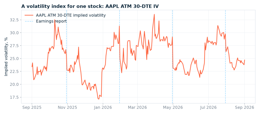

Here is a question that sounds simple and turns out to be surprisingly hard to answer: are options on Apple expensive right now?
Your broker will happily show you today’s implied volatility. Fine — but 25% implied volatility means nothing on its own. Is that high for Apple? Low? Perfectly ordinary for a Tuesday in September? Without a history to compare against, that number is just a number.
The obvious answer is “look at the VIX”, and the obvious answer is wrong. The VIX measures 30-day implied volatility on the S&P 500. It tells you what the market thinks about the market. It says nothing about how nervous traders are about Apple specifically, and even less about a mid-cap you happen to be looking at. Single-stock volatility indices do exist — CBOE has published them for a handful of large caps over the years — but not for the ticker you care about, not reliably, and not as a series you can pull on demand.
So let’s build one. In this article I’ll construct a historical implied volatility series for a single US stock — daily, at the money, 30 days to expiry — out of end-of-day options data. The whole thing runs on the free demo token, and by the end you’ll be able to say things like “Apple’s 30-day IV is at the 47th percentile of the past year”, which is an actual answer to an actual question.
Two things will get in the way. Both are worth knowing about before you write your own version, and neither is obvious from the documentation.
All figures below are as of 1 September 2026, the last day in my sample. Rerun the code and you’ll get your own.
What a historical implied volatility series actually is
Every listed option has its own implied volatility, and on any given day Apple has thousands of listed options. A strike far out of the money expiring next week and a strike near the money expiring in two years have wildly different IVs, and averaging them together gives you mush.
So we pin down two things and hold them fixed:
- At the money. The strike closest to where the stock is actually trading. This is where the most liquid, most informative options live.
- Roughly 30 days to expiry. Same horizon the VIX uses, and short enough to be sensitive to news without being pure expiry-week noise.
Fix those, take one reading per trading day, and you get a clean time series: the market’s 30-day forecast for how much this one stock is going to move, tracked day by day.
One honest caveat before we start, because I’d rather say it up front than bury it at the bottom. This is a proxy, not a reimplementation of the CBOE VIX methodology. The real thing interpolates across two expiries to hit exactly 30 days and integrates across the whole strike chain. We’re picking the nearest listed contract to the money and accepting an expiry somewhere in a 25-to-35-day window. For the question “is vol high or low for this name”, that’s plenty. For pricing a variance swap, it isn’t. Know which one you’re doing.
The fields that save you from Black-Scholes
If you’ve built something like this before against a raw options feed, you know the drill: fetch prices, fetch the risk-free rate, fetch dividends, then solve Black-Scholes backwards for each contract to recover implied volatility. It’s a lot of machinery, and every piece of it is a place to introduce a subtle bug.
The US Stock Options Data API ships implied volatility as a field, already computed by the data provider, on every contract row. That’s a trade-off worth naming: you inherit somebody else’s model assumptions about dividends and early exercise instead of choosing your own. For measuring how volatility moves over time it’s the right trade — the assumptions stay constant across the series, so the shape you’re studying is real even if the absolute level would shift slightly under a different model.
Two more fields quietly do most of our work:
- dte — days to expiry, as of that row’s date. No date arithmetic, no holiday calendars.
- moneyness — distance from the money. Magnitude is roughly the gap between strike and spot as a fraction of spot, and the sign tells you whether the contract is in or out of the money, not whether the strike is above or below the price. So a deep in-the-money put and a deep out-of-the-money call both sit far from zero, in opposite directions. We only ever use it to rank candidates by distance from the money, so we take the absolute value and the sign convention stops mattering.
Those two turn “find the at-the-money contract about 30 days out” from a research problem into a sort. Let’s confirm the shape of the data with one request — a slice of a single contract’s life, one row per trading day:
import requests

BASE = "https://eodhd.com/api/mp/unicornbay/options"
TOKEN = "demo"   # the demo token works for AAPL and AMZN, no registration

r = requests.get(f"{BASE}/eod", params={
    "filter[contract]": "AAPL270115C00260000",
    "fields[options-eod]": "contract,strike,type,dte,moneyness,volatility",
    "page[limit]": 5,
    "api_token": TOKEN,
})

for row in r.json()["data"]:
    a = row["attributes"]
    print(row["id"], a["dte"], a["moneyness"], a["volatility"])
Note the record id: it’s the contract name plus the date, like AAPL270115C00260000-2026-08-31. One row is one contract on one trading day. That detail is about to matter a lot.
Why the obvious approach cannot work
The natural first instinct is to grab a whole expiry and sort through it locally. Let’s actually measure that instead of guessing. Apple’s January 2026 expiry, every strike, every date, walking the pagination to the end:
params = {
    "filter[underlying_symbol]": "AAPL",
    "filter[exp_date_eq]": "2026-01-16",
    "fields[options-eod]": "contract,strike,type,dte",
    "page[limit]": 1000,
    "api_token": TOKEN,
}

url, pages, rows = f"{BASE}/eod", 0, []
while url:
    payload = requests.get(url, params=params).json()
    if "data" not in payload:            # we will hit this — see below
        print("stopped:", payload)
        break
    pages += 1
    rows += payload["data"]
    url = payload.get("links", {}).get("next")
    params = {"api_token": TOKEN} if url else None

print(f"{len(rows)} rows over {pages} pages")
This does not finish. It collects 11,000 rows across 11 pages and then stops with:
stopped: {'errors': {'page.offset': ['The page.offset may not be greater than 10000.']}}Pagination allows 1,000 records per request and caps the offset at 10,000, so a single query can reach about 11,000 rows and no further. And that one expiry is much bigger than that. Sweeping it in strike bands to count it properly, it comes to 62,978 rows — 96 strikes across 585 trading dates, calls and puts. Sixty-three pages of data behind an eleven-page door.
Five hundred and eighty-five dates for a single expiry surprised me too, until it didn’t: those contracts were listed nearly two years before they expired, and the endpoint returns every day of their life. There is no filter for the row’s own date — the tradetime filters match the contract’s last market activity, not the date of the record — so asking for one expiry always means asking for its entire history.
So brute force isn’t merely wasteful here, it’s impossible. What makes the job tractable is narrowing the strike range before you ask, using the one thing you already know: where the stock was trading.
Here’s what band width actually buys you, measured on that same expiry:
| Strike band around spot | Pages | Rows | Strikes | Usable dates in the 25–35 day window |
|---|---|---|---|---|
| ±1% | 2 | 1,208 | 2 | 7 |
| ±2% | 3 | 2,416 | 4 | 7 |
| ±3% | 4 | 3,624 | 6 | 7 |
| ±6% | 9 | 8,418 | 13 | 7 |
Every band yields the same seven usable dates — the wider ones just cost more. Tempting to take the cheapest row and move on. I tried that: a ±3% band over the full year still produced 253 daily observations from only 75 requests, which looks like a clear win — until you compare the output. On 28 of those 253 days the stock had drifted far enough from where it was when I picked the band that the genuinely at-the-money strike fell outside it, and the series quietly reported the second-best contract instead. The year’s volatility peak came out as 31.4% instead of 33.6%. Cheaper, and wrong exactly where it mattered.
So: ±6%. Nine pages per expiry instead of two, and no silent substitutions.
The second gotcha: next doesn’t carry your token
You’ll notice the pagination loop above puts the token back on every follow-up request. That isn’t decoration. The next link keeps your filters, your sort and your offset — but not your api_token. Follow it verbatim and you get:
401 UnauthenticatedWhich is a genuinely nasty way to learn the lesson, because page one works perfectly and the failure only shows up on page two. If you’ve ever had a paging loop die exactly one page in, this is a good first thing to check.
Building the series
First the underlying’s price history — one request for the whole window, which is what lets us narrow the strike band later:
from datetime import date, timedelta
from collections import defaultdict

SYMBOL = "AAPL"
START, END = date(2025, 9, 1), date(2026, 9, 1)

px = requests.get(f"https://eodhd.com/api/eod/{SYMBOL}.US", params={
    "from": "2025-08-01", "period": "d", "fmt": "json", "api_token": TOKEN,
}).json()

close = {row["date"]: row["adjusted_close"] for row in px}

def price_near(day):
    """Closest available close on or before `day` — handles weekends and holidays."""
    for back in range(8):
        key = (day - timedelta(days=back)).isoformat()
        if key in close:
            return close[key]
    return None
Then one function to pull an expiry inside a strike band, paginating properly and re-attaching the token:
REQUESTS = 0

def fetch_expiry(expiry, lo, hi):
    """Every row for one expiry inside a strike band, following pagination."""
    global REQUESTS
    params = {
        "filter[underlying_symbol]": SYMBOL,
        "filter[exp_date_eq]": expiry.isoformat(),
        "filter[strike_from]": lo, "filter[strike_to]": hi,
        "fields[options-eod]": "contract,strike,type,dte,moneyness,volatility",
        "page[limit]": 1000, "api_token": TOKEN,
    }
    url, rows = f"{BASE}/eod", []
    while url:
        payload = requests.get(url, params=params).json()
        REQUESTS += 1
        rows += payload.get("data", [])
        url = payload.get("links", {}).get("next")
        params = {"api_token": TOKEN} if url else None
    return rows
Now the loop. US equity options overwhelmingly expire on Fridays, so rather than spending requests to enumerate expiries we generate every Friday in the window and let empty responses tell us which ones don’t exist. It isn’t a perfect rule — of the 89 past Apple expiries I pulled, two landed on a Thursday (27 March 2024 and 17 April 2025, both ahead of a holiday), and heavily traded ETFs like SPY also list Monday and Wednesday weeklies. For a single name it costs you the odd expiry; if you extend this to SPY, enumerate expiries properly instead.
For each Friday, the dates where that expiry sits about 30 days out are roughly 25 to 35 days before it:
fridays = []
day = START
while day <= END + timedelta(days=40):
    if day.weekday() == 4:
        fridays.append(day)
    day += timedelta(days=1)

rows_by_date = defaultdict(list)

for expiry in fridays:
    spot = price_near(expiry - timedelta(days=30))
    if spot is None:
        continue
    for row in fetch_expiry(expiry, round(spot * 0.94), round(spot * 1.06)):
        a = row["attributes"]
        row_date = row["id"][-10:]
        if not a["volatility"] or a["dte"] is None:
            continue
        if 25 <= a["dte"] <= 35 and START.isoformat() <= row_date <= END.isoformat():
            rows_by_date[row_date].append(a)
What we have now is a bucket of candidate contracts per trading date. Turning that into one number per day means picking the closest to the money — separately for the call and the put, then averaging the two.
Averaging the pair is a convention rather than a law, and it’s worth knowing what it papers over. At a single strike near the money one leg is slightly in the money and the other slightly out, and the in-the-money leg is the less trustworthy of the two: wider spread, and for American-style puts an early-exercise premium the model has to guess at. Averaging keeps skew from leaking into what’s meant to be a level, which is what we want here. If you need a cleaner number, work from the out-of-the-money side or from a forward-implied ATM strike.
series = []

for day in sorted(rows_by_date):
    picks = {}
    for kind in ("call", "put"):
        same = [c for c in rows_by_date[day] if c["type"] == kind]
        if same:
            # closest to the money first, then closest to 30 days
            picks[kind] = min(same, key=lambda c: (abs(c["moneyness"]), abs(c["dte"] - 30)))

    if not picks:
        continue

    ivs = [p["volatility"] for p in picks.values()]
    series.append({
        "date": day,
        "iv": round(sum(ivs) / len(ivs), 4),
        "iv_call": picks.get("call", {}).get("volatility"),
        "iv_put": picks.get("put", {}).get("volatility"),
        "strike": picks[next(iter(picks))]["strike"],
    })

print(f"{len(series)} daily observations from {REQUESTS} requests")
For Apple over the twelve months to 1 September 2026 that prints:
253 daily observations from 97 requestsEssentially every trading day in the window, for under a hundred requests. Your exact count will differ by a page or two and will creep up over time — each new trading day adds rows to every live expiry, so a band that fits in four pages today needs five next month. The observation count and the volatility figures are unaffected; only the request tally drifts.
Cheap enough to run across a watchlist without thinking about it — which is exactly what the naive version could not do at any price.
What a year of Apple’s implied volatility shows
Here’s the series, with Apple’s four earnings reports marked.
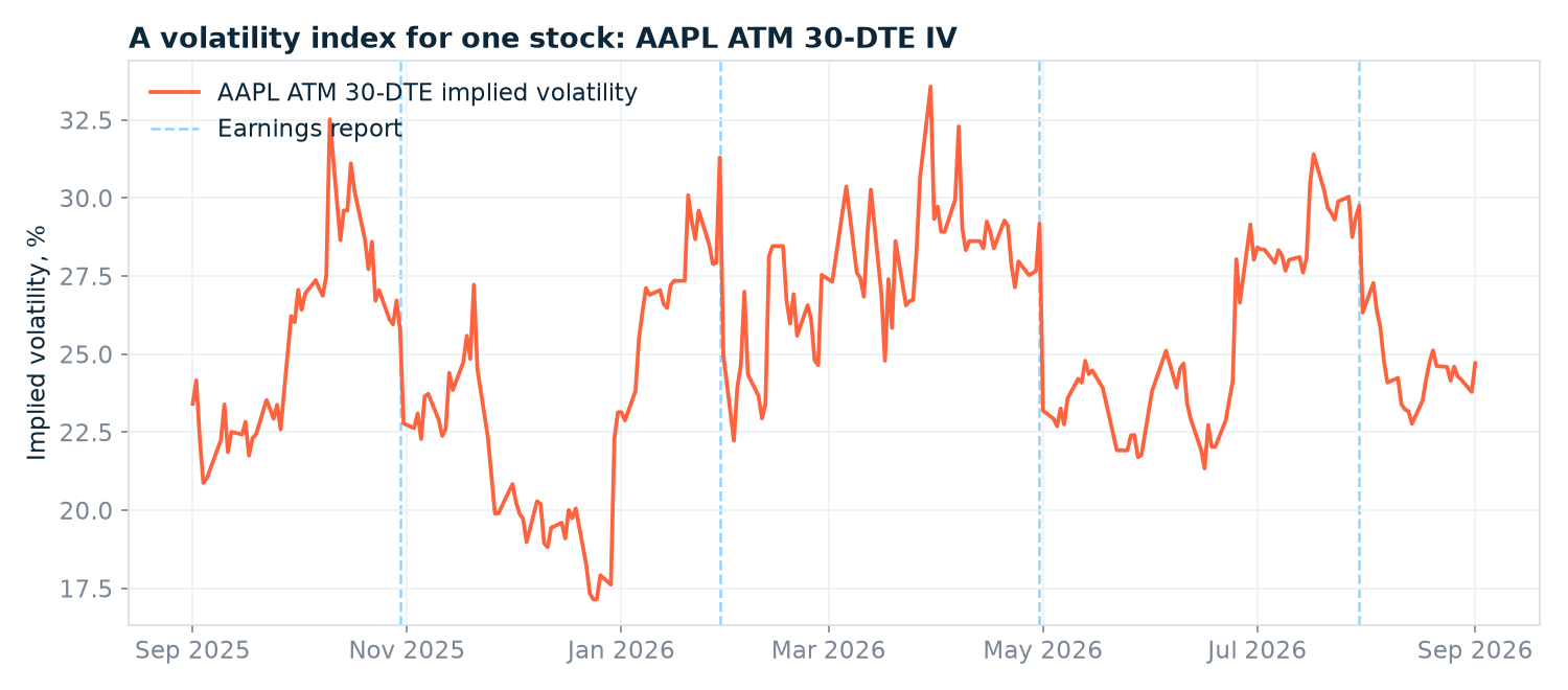
Over the year, 30-day IV ranged from 17.2% to 33.6%, with a median of 25.1%. That range is the context that was missing at the start: 25% isn’t “high” or “low” for Apple, it’s dead average. The last observation, 1 September 2026, came in at 24.7% — the 47th percentile of the year. Neither cheap nor expensive. That’s a boring answer, and boring answers are worth a lot when the alternative is guessing.
Now look at what happens at those dashed lines. Every single one is followed by a cliff:
| Earnings date | IV on the day | IV five sessions later | Change | Stock’s next-day move |
|---|---|---|---|---|
| 30 Oct 2025 | 25.8% | 23.6% | −2.1 pp | −0.38% |
| 29 Jan 2026 | 31.3% | 27.0% | −4.3 pp | +0.46% |
| 30 Apr 2026 | 29.2% | 22.8% | −6.4 pp | +3.24% |
| 30 Jul 2026 | 29.8% | 24.8% | −5.0 pp | −7.35% |
Four reports, four collapses, averaging 4.5 percentage points in five sessions. This is the well-known “IV crush”, and it’s satisfying to watch it fall out of data you assembled yourself rather than read about it in a textbook.
Look at that last row, though. Apple dropped 7.35% the day after its July report — a big move, exactly the kind of thing you’d want to own options for. And implied volatility still fell 5 points. If you had bought a straddle into that print, you were right about the stock moving and could still have lost money, because you paid for volatility that evaporated the moment the uncertainty did. Direction was never the whole trade.
Here’s something else the data says, and it contradicts what everybody repeats. The standard line is that IV ramps up into earnings. Across these four reports it didn’t: IV ten sessions before the announcement averaged 0.4 points higher than on the day itself. Four reports is a small sample and I wouldn’t generalise from it — but in this window the run-up simply wasn’t there, while the collapse was, every time. That asymmetry is the kind of thing you can only check with history.
And the biggest volatility spike of the entire year had nothing to do with earnings at all. On 30 March 2026 Apple’s 30-day IV hit 33.6%, the high of the sample, with no report anywhere near. The stock sat at $246 and barely moved that week. Then it rallied to $272 by 20 April — up nearly 11%. The options market had priced a storm; what arrived was a rally. Implied volatility is the price of expected movement, not a prediction of which way, and it is frequently just wrong.
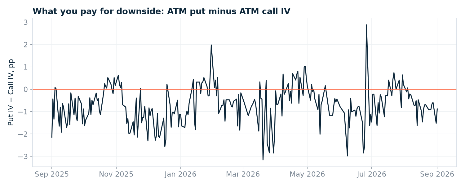
One more series worth plotting, almost free now that the pieces are in place. We kept the call and put IV separately, so subtracting one from the other gives a running measure of what downside protection costs relative to upside:
gap = [
    (s["date"], (s["iv_put"] - s["iv_call"]) * 100)
    for s in series
    if s["iv_put"] and s["iv_call"]
]
And the practical version of the original question — a percentile, not a level:
def iv_percentile(series):
    values = sorted(s["iv"] for s in series)
    latest = series[-1]["iv"]
    rank = sum(1 for v in values if v <= latest) / len(values)
    return latest, rank

iv, rank = iv_percentile(series)
print(f"latest IV {iv:.1%} — {rank:.0%} percentile of the window")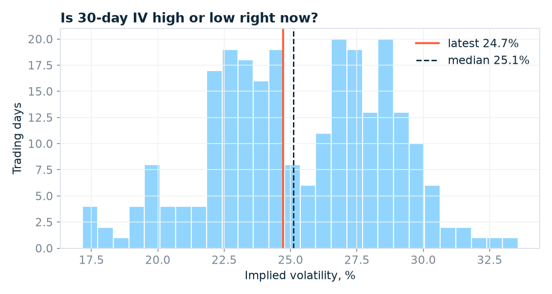
“Apple’s 30-day IV is at the 47th percentile of the past year” is a sentence you can act on. “Apple’s IV is 24.7%” is not.
Change the symbol to AMZN and the same code gives you Amazon’s volatility index. Put the two side by side and you get the clearest possible argument for why levels are useless on their own.
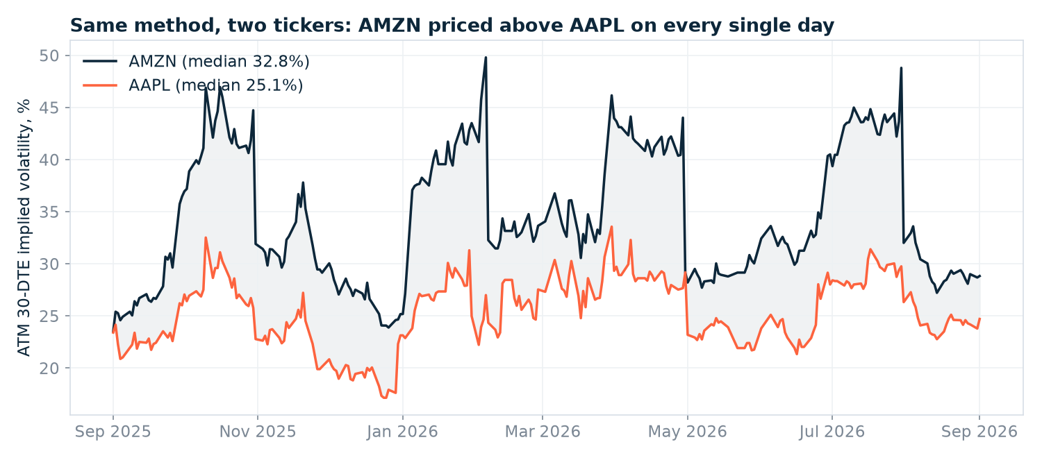
Amazon’s 30-day IV sat above Apple’s on 252 of the 253 days — every day but one — averaging 9.3 points higher, median 32.8% against 25.1%. Now look what that does to the original question. On 1 September 2026 Amazon printed 28.8% and Apple 24.7%. The bigger number is the cheaper one: 28.8% is Amazon’s 22nd percentile for the year, while Apple’s 24.7% is its 47th. Sort a watchlist by raw implied volatility and you will get Amazon above Apple every single day, which tells you nothing you didn’t know. Rank each name against its own history and you find out which options are actually on sale.
Where this breaks
Four things to keep in mind before you lean on this.
It’s end-of-day, and that’s a feature here. One clean reading per session is exactly what you want for a historical series. But it means you cannot use this to react intraday, and you shouldn’t pretend otherwise — if your idea depends on where IV was at 11:30, this dataset can’t tell you.
The 25-to-35-day window is a compromise. Some days you’ll land on a 26-day contract and some on a 34-day one, and since the volatility term structure slopes, that introduces a little jitter that isn’t real vol movement. If it bothers you, interpolate between the two nearest expiries to hit exactly 30 days. You have everything you need to do that; I left it out to keep the code readable.
Nearest-to-the-money is not the same as at-the-money. When strikes are spaced $5 apart and the stock sits between two of them, your “ATM” contract is up to $2.50 off. On a $250 stock that’s noise; on a $12 stock it isn’t. This is also why the band width mattered: get it wrong and you don’t get an error, you get a slightly worse contract and a slightly wrong number.
Liquidity decides whether any of this means anything. Apple and Amazon have deep, tightly quoted chains, so their implied volatility is a real market price. Go far enough down the market-cap ladder and you’ll find contracts whose IV is derived from a quote nobody would trade against. The data will happily hand you a number; the bid-ask spread, volume and open interest fields are how you decide whether to believe it. Filter on them before you trust a thin name.
Run it on your own ticker
Everything above runs on the demo token, which covers AAPL and AMZN without registration — including the price history call. Change one variable and you have Amazon’s volatility index instead. Copy the code, run it, and you’ll have a year of ticker-level IV history in a couple of minutes.
Beyond those two tickers you’ll need a key. The US Stock Options Data API covers roughly 6,900 US underlyings with history back to October 2023, and every contract row carries implied volatility, all five Greeks, open interest and bid/ask alongside the days-to-expiry and moneyness fields we leaned on here. The API documentation has the full parameter list.
Two directions worth taking this next. Run the loop across a basket and you can rank names by how expensive their options are relative to their own history — a far more useful screen than sorting by raw IV, which just surfaces the most volatile stocks every time. Or hold the date fixed and vary strike and expiry instead of pinning them, and the same rows give you the volatility surface: skew across strikes, term structure across expiries.
Next time I want to go after a noisier question — spotting unusual options activity from end-of-day data, and being honest about what “unusual” can and can’t mean when you only see the close.