
This article will demonstrate how to create a stock market heatmap in Python. The concept is to look for a correlation between stock market tickers that are in a Bullish or Bearish state and their Return. The SMA50/SMA200 will be used to determine the market state. If the SMA50 is above the SMA200, the market is in a Bullish state, otherwise it’s Bearish. The Return is calculated by subtracting the previous closing price from the current closing price, then dividing it by the previous closing price, and multiplying it by 100.
Quick jump:
Gathering and Preprocessing our data
EODHD API’s will be able to provide the historical data we need, but which stock market tickers shall we use? The S&P 500 index has slightly over 500 companies in it as some companies have more than one share type. There is a list of these companies on Wikipedia. I wrote some Python code to data scrape this page and extract the list of company codes and create a list.
import requests
import pandas as pd
from io import StringIO

def get_sp500_tickers():
    url = "https://en.wikipedia.org/wiki/List_of_S%26P_500_companies"
    html = requests.get(url).text
    data = StringIO(html)
    df = pd.read_html(data, header=0)[0]
    tickers = df["Symbol"].tolist()
    return tickers

sp500_tickers = get_sp500_tickers()
print(sp500_tickers)
With this list of company codes in the S&P 500, we now want to cross check this against the list of US markets on EODHD APIs to make sure all the markets we need are there. We want the output to be a Python list. In the code below, I’m importing my API_KEY from config.py.
import config as cfg
from eodhd import APIClient

api = APIClient(cfg.API_KEY)

df_symbols = api.get_exchange_symbols("US")
eodhd_tickers = df_symbols["Code"].tolist()
print(eodhd_tickers)Now that we have the two lists we want to do a quick check to make sure it all looks fine to proceed.
for sp500_ticker in sp500_tickers:
    if sp500_ticker not in eodhd_tickers:
        print("Missing: ", sp500_ticker)
    else:
        print("Found: ", sp500_ticker)
You will notice that there are a couple of tickers that are not found but it’s unimportant as they are some of the “B” shares from some of the companies that are listed more than once in the S&P 500 index. We can ignore those. The most important outcome is to have our list of 500 companies, which we do.
The next step is we want to extend the code for “Found” companies and retrieve the historical data for each company. I have limited this to the last 200 daily candles. I then applied the SMA50/SMA200 to the market historical data to determine the Bullish or Bearish state. I also calculated the Return as mentioned in the beginning of the article. For each market we retrieve and process we want to append the results to a file called “sp500.csv“. Create the empty file and manually add the heading, “Stock Symbol,Date,Closing Price, Market State, Return“.
def calculate_technical_indicators(df):
    df_ta = df.copy()
    df_ta["sma50"] = df_ta["close"].rolling(50, min_periods=0).mean()
    df_ta["sma200"] = df_ta["close"].rolling(200, min_periods=0).mean()
    df_ta["bull"] = df_ta.sma50 > df_ta.sma200
    return df_ta

for sp500_ticker in sp500_tickers:
    if sp500_ticker not in eodhd_tickers:
        print("Missing: ", sp500_ticker)
    else:
        print("Found: ", sp500_ticker)

        df_ticker_history = api.get_historical_data(
            f"{sp500_ticker}.US", "d", results=200
        )
        df_ticker_history_ta = calculate_technical_indicators(df_ticker_history)
        df_ticker_history_ta["date"] = df_ticker_history_ta.index

        df_result = df_ticker_history_ta[["symbol", "date", "close", "bull"]].copy()
        df_result.columns = ["Stock Symbol", "Date", "Closing Price", "Market State"]

        df_result.loc[:, "Return"] = (
            (df_result["Closing Price"] - df_result["Closing Price"].shift(1))
            / df_result["Closing Price"].shift(1)
        ) * 100

        df_result.loc[:, "Market State"] = df_result["Market State"].apply(
            lambda x: "Bullish" if x else "Bearish"
        )

        df_result.loc[:, "Return"] = df_result["Return"].fillna(0)
        df_result.loc[:, "Stock Symbol"] = df_result["Stock Symbol"].str.replace(".US", "")

        print(df_result.to_csv("sp500.csv", mode="a", index=False, header=False))
When this completes we will be left with a “sp500.csv” file that looks like this…
Stock Symbol,Date,Closing Price, Market State, Return
MMM,2023-06-02,102.53,Bearish,0.0
MMM,2023-06-05,97.98,Bearish,-4.437725543743292
MMM,2023-06-06,98.29,Bearish,0.3163911002245379
MMM,2023-06-07,101.0,Bearish,2.7571472174178386
...
My file has 68558 lines, including the header.
High-quality data is essential for generating accurate and insightful visualizations. Poor data quality can lead to misleading results, which can negatively impact decision-making. Ensuring that you use reliable data sources is crucial to the success of your analysis.
Learn more about data reliability in our detailed comparison:
Free vs Paid Stock Data: Which One Can You Trust?
Correlation Matrix
In order to create our stock market heatmap, we will first need to import our data into a Pandas dataframe and create ourselves a pivot table that will be used to create our correlation matrix.
df = pd.read_csv("sp500.csv")
print(df)

pivoted_df = df.pivot(index="Date", columns="Stock Symbol", values="Closing Price")
print(pivoted_df)

corr_matrix = pivoted_df.corr()
Stock Market Heatmaps
Before I continue, I just want to warn you that creating a correlation matrix of this size won’t be pretty. In fact, “out the box“, it will be almost impossible to interpret and read. It will however form our starting point, so I’ll show you how to create a basic stock market heatmap. You will need to install the Python library “seaborn” if you haven’t already done so.
import seaborn as sns

plt.figure(figsize=(16, 16))
sns.heatmap(corr_matrix, annot=True, cmap="coolwarm")
plt.title("Heatmap of Stock Price Correlations")
plt.savefig("heatmap-full.png")
plt.tight_layout()
plt.show()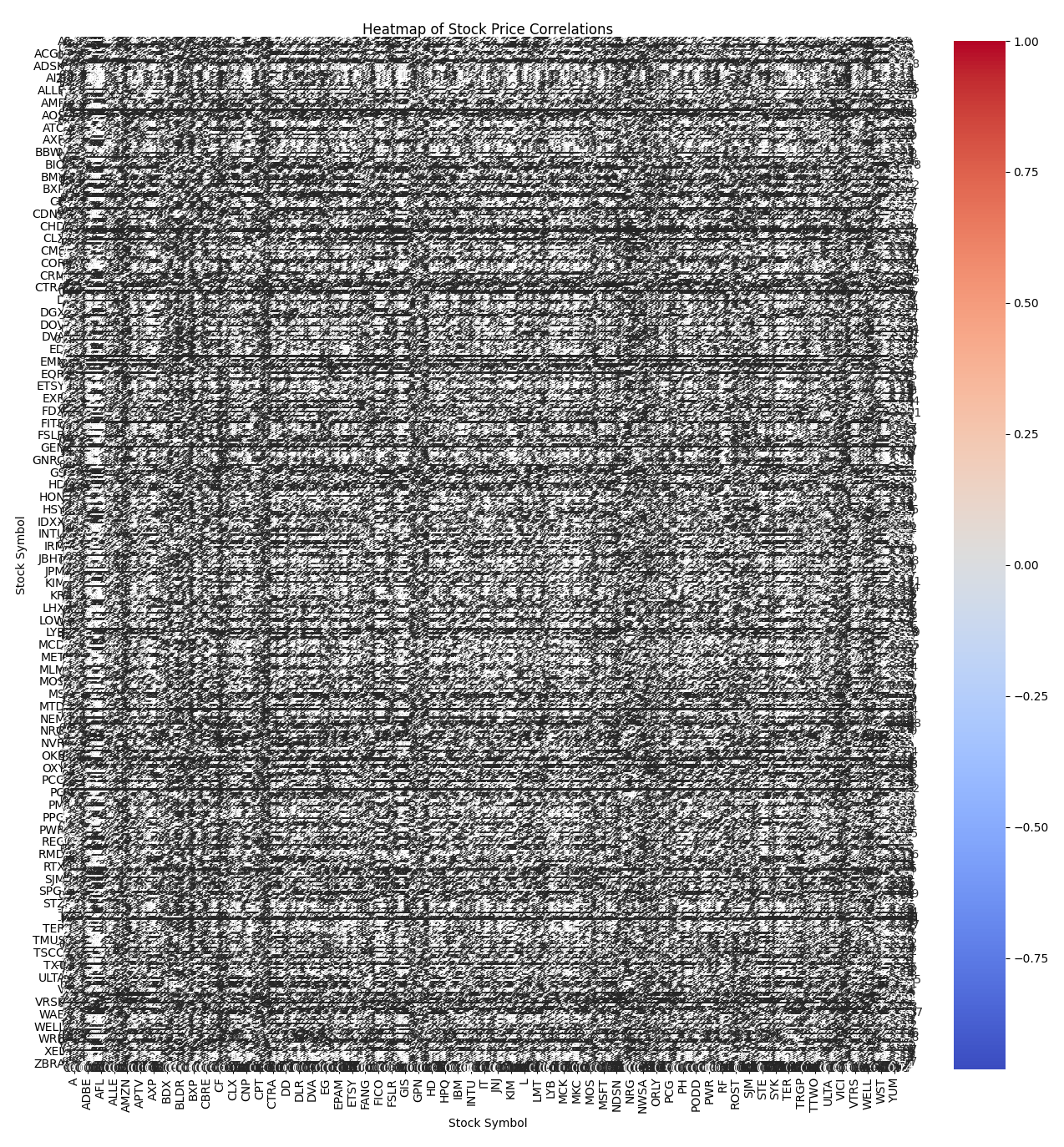
There are a number of ways we can try and improve this. The first method would be to add a threshold for the correlation. For example 0.8, but you can experiment to find the right balance.
threshold = 0.8
high_corr = corr_matrix[(corr_matrix >= threshold) & (corr_matrix < 1)]

plt.figure(figsize=(16, 16))
sns.heatmap(high_corr, annot=True, cmap="coolwarm")
plt.title("Heatmap of Stock Price Correlations")
plt.savefig("heatmap-0.8.png")
plt.tight_layout()
plt.show()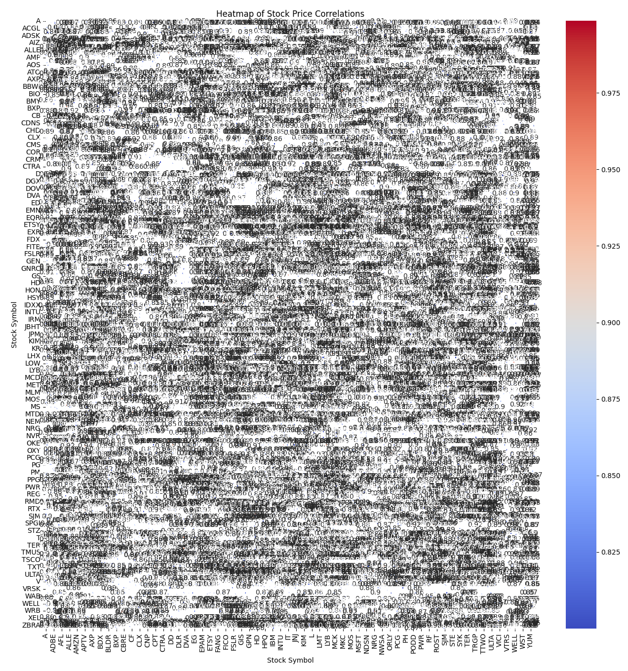
It’s difficult to tell from this image, but there is an improvement. Not enough for it to warrant spending more time on this option. You may be able to get more of an improvement by adjusting the threshold further but it’s better to take a look at he next option.
Clustermap
A cluster map does provide an alternative to the heat map and does look visually a lot better.
plt.figure(figsize=(16, 16))
sns.clustermap(corr_matrix, cmap="coolwarm")
plt.title("Cluster Map of Stock Price Correlations")
plt.savefig("clustermap.png")
plt.tight_layout()
plt.show()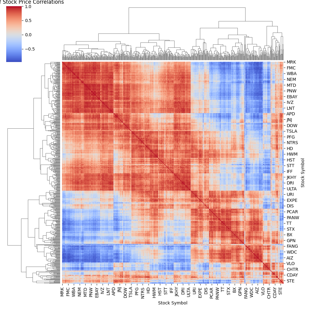
This is showing markets that are highly correlated in a warm red and lower correlated in a cooler blue.
Top n Stock Market Heatmap
An alternative headmap approach would be to plot the top 50.
def get_top_n_correlations(corr_matrix, n):
    c = corr_matrix.abs().stack()
    return c[c < 1].sort_values(ascending=False).drop_duplicates().head(n)

top_n = get_top_n_correlations(corr_matrix, 50)

top_pairs = pd.DataFrame(list(top_n.index), columns=["Stock 1", "Stock 2"])
top_pairs["Correlation"] = top_n.values

top_pairs_pivot = top_pairs.pivot(
    index="Stock 1", columns="Stock 2", values="Correlation"
)

plt.figure(figsize=(16, 16))
sns.heatmap(top_pairs_pivot, annot=True, cmap="coolwarm")
plt.title("Cluster Map of Stock Price Correlations")
plt.savefig("top_n_heatmap.png")
plt.tight_layout()
plt.show()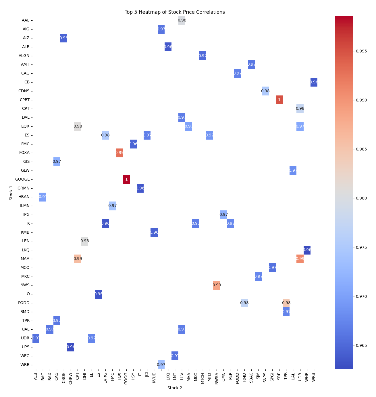
This representation is by far the easiest to read and interpret.
Stock Market Heatmap by Industry
When we look at finding correlations between a large number of stock market tickers, it can become chaotic quickly. My preferred approach is to group the markets by Sector, and find the correlations by Sector.
On the Wikipedia page I linked earlier, I used “Symbol” to generate a list of stock market tickers in the S&P 500. You may have noticed that there were two additional columns of interest, “GICS Sector” and “GICS Sub-Industry“. The following Python code will create a mapping dictionary to map a “Symbol” with an “Sector“.
def sp500_sector_mapping():
    url = "https://en.wikipedia.org/wiki/List_of_S%26P_500_companies"
    html = requests.get(url).text
    data = StringIO(html)
    df = pd.read_html(data, header=0)[0]
    ticker_meta = df[[
        "Symbol",
        "GICS Sector"
        # "GICS Sub-Industry"
    ]].to_dict(orient='records')

    mapping_dict = {}
    for ticker in ticker_meta:
        mapping_dict[ticker["Symbol"]] = ticker["GICS Sector"]

    return mapping_dict

sector_mapping = sp500_sector_mapping()
Then using this code will now map the correlation between sectors represented as a stock market heatmap.
mapped_sectors = corr_matrix.columns.map(sector_mapping)
mean_corr_by_sector = (
    corr_matrix.groupby(mapped_sectors).mean().groupby(mapped_sectors, axis=1).mean()
)

plt.figure(figsize=(16, 16))
sns.heatmap(mean_corr_by_sector, annot=True, cmap="coolwarm")
plt.title("Heatmap of Stock Price Sector Correlations")
plt.savefig("heatmap_sector.png")
plt.tight_layout()
plt.show()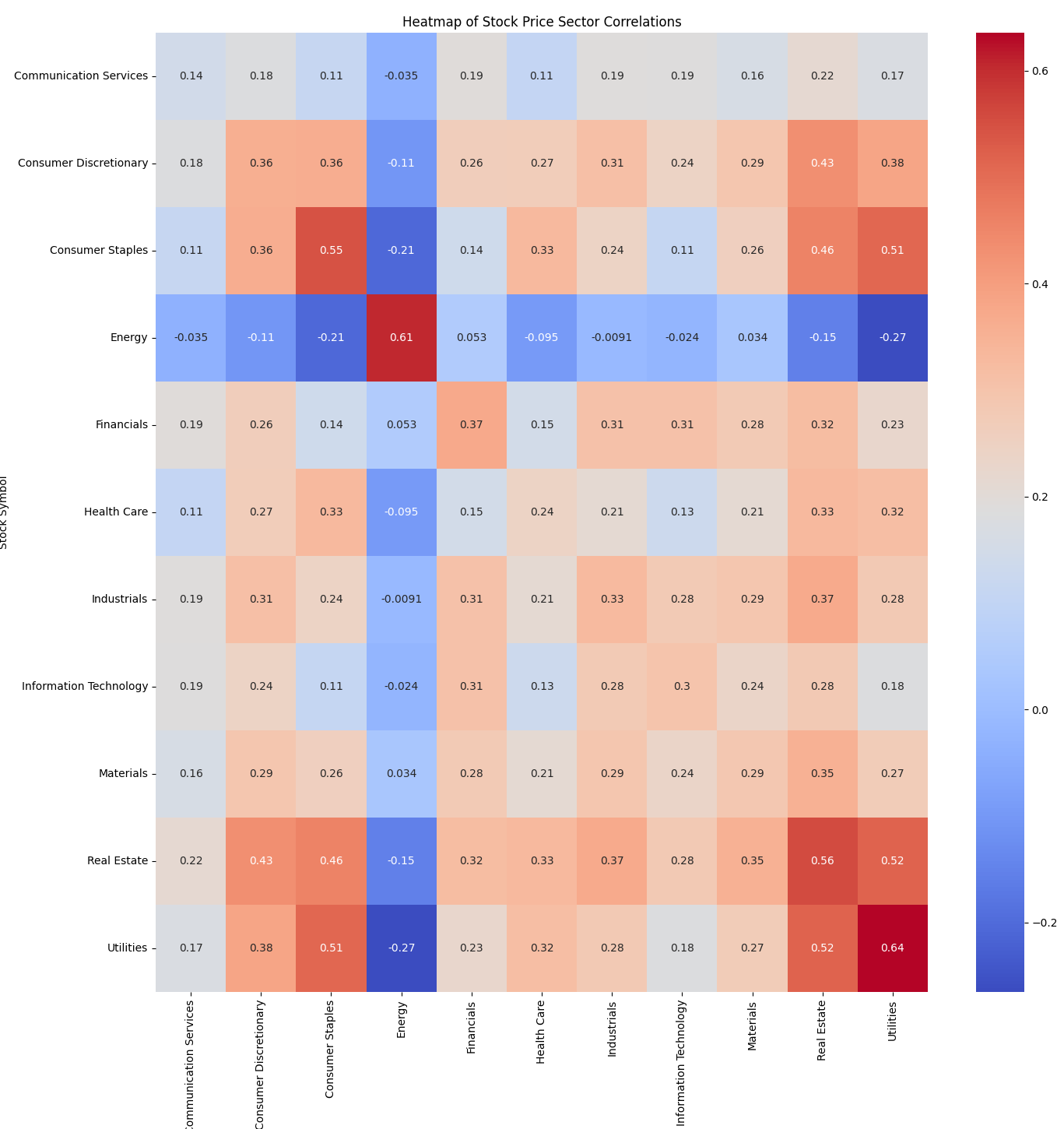
Conclusion
I have provided a variety of techniques to demonstrate stock market heat maps in Python. I also included an introduction into website data scraping and cluster maps.