

Clustering stocks can substantially enhance your trading strategies and assist in managing diversification with professionalism. The concept of clustering involves the grouping of stocks according to their fundamental characteristics and/or their price movements.
A common way to classify stocks is by sector. If you haven’t already, consider making sector diversification a key part of your investment strategy. This involves holding stocks across different sectors to prevent over-reliance on one sector’s performance. While all these methods are used for risk management, clustering stocks by selecting our own features definitely adds another dimension to our trading style.
How to trade based on clusters
Pairs Trading and Statistical Arbitrage
This strategy is based on finding stocks that typically move in tandem but have temporarily diverged. When one stock (stock A) surges while the other (stock B) lags, you take a short position in stock A and a long position in stock B. Statistically, these stocks tend to converge again over time, allowing you to capture profits as their prices realign. While this approach is most commonly used with pairs of stocks, it can also be extended to a group by going long on those that have under-performed and short on those that have outperformed.
Market Regime Detection
Grouping can help you identify real-time market trends—whether bullish, bearish, or sideways—by clustering periods that share similar characteristics in price movement, volatility, or trading volume. Once a trend is recognised, you can adjust your trading strategy accordingly:
- In a bullish cluster, go for long positions or momentum strategies.
- In a bearish cluster, use shorting or protective hedges.
- In a sideways cluster, go for mean-reversion or range-bound strategies.
Identify opportunities
Cluster analysis can complement or even replace your existing stock screeners. If you already use specific criteria to filter stocks for potential opportunities, it’s a good idea to also examine which stocks are grouped together with the one you’re analysing. This approach might uncover promising stocks that you haven’t considered yet or that your screener may have missed.
But how can we do that?
Gather the data
We will use the EODHD APIs for pricing and fundamentals, but before that let’s do the imports and get all the SP500 stocks:
import requests
import pandas as pd
import requests_cache
import os
from matplotlib import pyplot as plt
from tqdm import tqdm
import warnings

api_token = os.environ.get('EODHD_API_TOKEN')

def get_sp500_tickers():

    INDEX_NAME = 'GSPC.INDX'
    url = f'https://eodhd.com/api/mp/unicornbay/spglobal/comp/{INDEX_NAME}'
    query = {'api_token': api_token, "fmt": "json"}

    data = requests.get(url, params=query)

    if data.status_code != 200:
        tqdm.write(f"Error: {data.status_code}")
        tqdm.write(data.text)
        return []

    data = data.json()
    df_stocks = pd.DataFrame(data['Components']).T.reset_index()

    df_stocks.to_csv('csv/stocks_universe.csv', index=False)
    tickers = df_stocks['Code'].tolist()
    return tickers


# Get S&P 500 tickers
sp500_tickers = get_sp500_tickers()
Now lets get the prices of all the SP500 stocks from 2024 and store them in a dataframe named sp_500_prices_df
start_date = '2024-01-01'
sp_500_prices_df = pd.DataFrame()

for ticker in tqdm(sp500_tickers, desc="Fetching ticker data"):
    try:
        # Construct the API URL
        ticker_code = f"{ticker}.US"
        url = f'https://eodhd.com/api/eod/{ticker_code}'

        # Set query parameters
        query = {
            'api_token': api_token,
            'fmt': 'json',
            'from': start_date
        }

        response = requests.get(url, params=query)

        if response.status_code == 200:
            # Parse the JSON response
            data = response.json()

            # Convert to DataFrame
            ticker_df = pd.DataFrame(data)

            # Extract date and adjusted_close
            if 'adjusted_close' in ticker_df.columns:
                prices = ticker_df[['date', 'adjusted_close']].copy()
                prices.set_index('date', inplace=True)

                # Rename the column to the ticker symbol
                prices.rename(columns={'adjusted_close': ticker}, inplace=True)

                # Join with the main DataFrame
                if sp_500_prices_df.empty:
                    sp_500_prices_df = prices
                else:
                    sp_500_prices_df = sp_500_prices_df.join(prices, how='outer')

            else:
                tqdm.write(f"No adjusted close data available for {ticker}")
        else:
            tqdm.write(f"Error fetching data for {ticker}: {response.status_code}")
            tqdm.write(response.text)
    except Exception as e:
        tqdm.write(f"Exception occurred while processing {ticker}: {str(e)}")

returns = sp_500_prices_df.pct_change().dropna()
The next step is to get into the fundamentals. We’ll enrich our S&P 500 stocks dataframe by adding columns for Sector, Industry, Market Capitalisation, and P/E ratio—details that will be essential for our grouping later on. For Market Capitalisation, you’ll see that I categorize it into more intuitive groups, such as Mega, Large, and so on, to make the data easier to interpret.
df = pd.DataFrame()

# Fetch fundamental data for each ticker
for ticker in tqdm(sp500_tickers, desc="Fetching fundamental data"):
    try:
        # Construct the API URL
        ticker_code = f"{ticker}.US"
        url = f'https://eodhd.com/api/fundamentals/{ticker_code}'

        # Set query parameters
        query = {
            'api_token': api_token,
            'fmt': 'json'
        }

        # Make the API request
        response = requests.get(url, params=query)

        # Check if the request was successful
        if response.status_code == 200:
            # Parse the JSON response
            data = response.json()

            # Extract the required metrics
            metrics = {
                'Ticker': ticker,
                'Name': data.get('General', {}).get('Name', None),
                'Sector': data.get('General', {}).get('Sector', None),
                'Industry': data.get('General', {}).get('Industry', None),
                'Market Capitalisation': data.get('Highlights', {}).get('MarketCapitalization', None),
                'P/E Ratio': data.get('Highlights', {}).get('PERatio', None)
            }

            # Add to the dataframe
            df = pd.concat([df, pd.DataFrame([metrics])], ignore_index=True)
        else:
            tqdm.write(f"Error fetching fundamental data for {ticker}: {response.status_code}")
            tqdm.write(response.text)
    except Exception as e:
        tqdm.write(f"Exception occurred while processing fundamental data for {ticker}: {str(e)}")

# Define capitalization bins and labels
bins = [0, 1e10, 1e11, 1e12, 1e13]
labels = ['Small (<10B)', 'Medium (10B-100B)', 'Large (100B-1T)', 'Mega (>1T)']

# Create a new column for capitalization bins
df['Cap_Bin'] = pd.cut(df['Market Capitalisation'], bins=bins, labels=labels)
We will also add in the same dataframe the 6-month volatility, which will later be used as a feature for grouping.
sp_500_prices_df.index = pd.to_datetime(sp_500_prices_df.index)

# Sort by date
sp_500_prices_df = sp_500_prices_df.sort_index()

# Get the last 6 months of data
six_months_ago = sp_500_prices_df.index[-1] - pd.DateOffset(months=6)
six_month_prices = sp_500_prices_df[sp_500_prices_df.index >= six_months_ago]

# Calculate daily returns
daily_returns = six_month_prices.pct_change().dropna()

# Calculate volatility (standard deviation of returns)
volatility = daily_returns.std() * (252 ** 0.5)  # Annualized volatility

# Add volatility to the fundamentals dataframe
for ticker in sp500_tickers:
    if ticker in volatility.index:
        mask = df['Ticker'] == ticker
        df.loc[mask, '6-Month Volatility'] = volatility[ticker]
Clustering with fundamentals
With all the required data in place, we’ll now organise the stocks into 11 clusters. I selected this number because there are 11 sectors in the S&P 500, and I’m interested to see how closely our clusters will match the actual sector classifications.
In a nutshell:
- We define the features and normalise them
- In case there are missing data we impute them
- We use Principal Component Analysis (PCA) to reduce the complexity
- We use K-Means and group them into 11 clusters
# Preprocessing
features = df[['Market Capitalisation','P/E Ratio','6-Month Volatility']]

# Normalize features
from sklearn.preprocessing import StandardScaler

scaler = StandardScaler()
scaled_data = scaler.fit_transform(features)

# Impute Missing Data
# The most common approach is to fill missing values with the mean, median, or another strategy using SimpleImputer from scikit-learn:

from sklearn.impute import SimpleImputer

imputer = SimpleImputer(strategy='mean')  # or 'median'
imputed_data = imputer.fit_transform(features)

from sklearn.preprocessing import StandardScaler
from sklearn.decomposition import PCA

scaler = StandardScaler()
scaled_data = scaler.fit_transform(imputed_data)

pca = PCA(n_components=0.95)
principal_components = pca.fit_transform(scaled_data)

from sklearn.cluster import KMeans

k = 11  # Typical for sector-based clustering
model = KMeans(n_clusters=k)
clusters = model.fit_predict(principal_components)
df['ClusterFeatures'] = clusters
Let’s plot and see how the stocks are distributed per sector:
# Group by Sector and ClusterCorrelation, then count
sector_cluster_counts = df.groupby(['Sector', 'ClusterFeatures']).size().reset_index(name='Count')

# Pivot for a matrix view
pivot_table = sector_cluster_counts.pivot(index='Sector', columns='ClusterFeatures', values='Count').fillna(0).astype(int)

# Create a stacked bar chart
plt.figure(figsize=(14, 10))
pivot_table_percentage = pivot_table.div(pivot_table.sum(axis=1), axis=0) * 100

# Plot stacked bar chart
pivot_table_percentage.T.plot(kind='bar', stacked=True, figsize=(14, 10), colormap='tab20')
plt.title('Percentage Distribution of Sectors across Correlation Features', fontsize=16)
plt.xlabel('Correlation Features', fontsize=14)
plt.ylabel('Percentage', fontsize=14)
plt.legend(title='Sector', bbox_to_anchor=(1.05, 1), loc='upper left')
plt.tight_layout()
plt.show()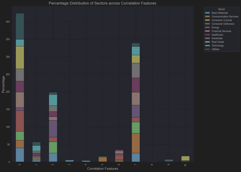
Not so insightful. The groups are unbalanced and not related to sector. So lets use some box plots:
import matplotlib.pyplot as plt
import seaborn as sns

# Set up the figure with 3 subplots side by side
fig, axes = plt.subplots(1, 3, figsize=(18, 6))

# Boxplot for Market Capitalization
sns.boxplot(x='ClusterFeatures', y='Market Capitalisation', data=df, ax=axes[0])
axes[0].set_title('Market Cap by Correlation Cluster')
axes[0].set_ylabel('Market Cap ($)')
axes[0].set_xlabel('Correlation Cluster')
# Use log scale for Market Cap due to wide range
axes[0].set_yscale('log')

# Boxplot for P/E Ratio
sns.boxplot(x='ClusterFeatures', y='P/E Ratio', data=df, ax=axes[1])
axes[1].set_title('P/E Ratio by Correlation Cluster')
axes[1].set_ylabel('P/E Ratio')
axes[1].set_xlabel('Correlation Cluster')
# Set a reasonable y-limit to handle outliers
axes[1].set_ylim(0, df['P/E Ratio'].quantile(0.95))

# Boxplot for 6-Month Volatility
sns.boxplot(x='ClusterFeatures', y='6-Month Volatility', data=df, ax=axes[2])
axes[2].set_title('6-Month Volatility by Correlation Cluster')
axes[2].set_ylabel('Volatility (Annualized)')
axes[2].set_xlabel('Correlation Cluster')

plt.tight_layout()
plt.show()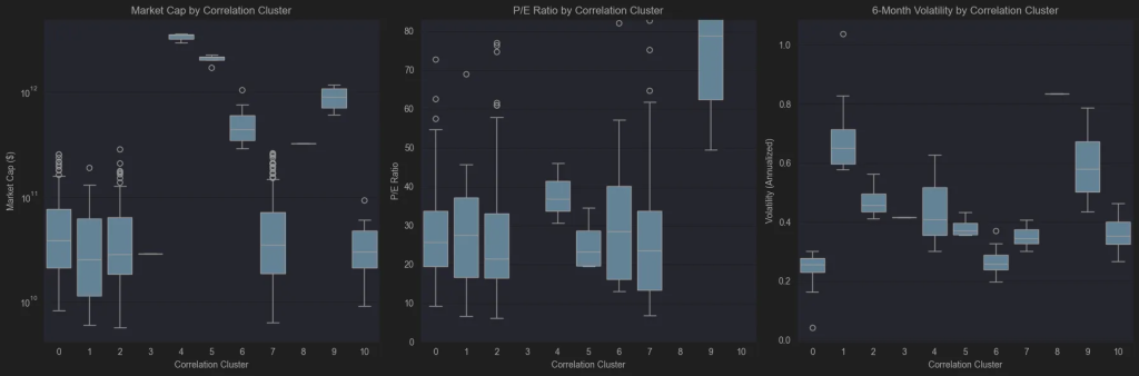
What I can see from the box plots in a first glance is:
- Group 4 consists of Apple, Nvidia, and Microsoft—clearly representing the largest stocks by market capitalization. Group 5 features the next tier of giants, including Google, Amazon, and Meta, while Group 9 brings together Broadcom, Lilly, Oracle, and Tesla. The accompanying boxplot of P/E Ratios shows that the algorithm effectively distinguished these mega-cap companies based on their P/E Ratio.
- It’s also noteworthy that groups 0, 1, 2, 7, and 10 are predominantly made up of small- and mid-cap stocks. Group 10 stands out with the highest P/E ratio and shows moderate to low volatility, while the remaining four groups are mainly distinguished by their varying levels of volatility.
I use this method when I see a stock I like and want similar stocks with comparable features. I don’t want to miss an opportunity if I’m right, as other stocks in the same group could be even better options. This may seem like it could be done easily with a good screener. But with more features and groups, this method can quickly generate groups of stocks sharing the same features, expanding your search and providing better insights for decision-making.
Clustering with price correlation
Now we move to something more interesting and familiar – the price action! We’ll perform and other clustering process using each stock’s correlation, grouping (again into 11 clusters) stocks based on their price movements.
In a nutshell:
- Calculate the correlation matrix.
- Convert the correlations into distances.
- Perform hierarchical clustering using the average linkage method.
import numpy as np

corr_matrix = returns.corr()

distance_matrix = np.sqrt(2 * (1 - corr_matrix))
distance_matrix

from scipy.cluster.hierarchy import linkage, dendrogram

# Average linkage often performs best for financial data[1][5]
Z = linkage(distance_matrix, method='average')

from scipy.cluster.hierarchy import fcluster

# t is the number of clusters
clusters = fcluster(Z, t=11, criterion='maxclust')

df.to_csv('csv/sp500_clustered.csv', index=False)
df['ClusterCorrelation'] = clusters
Now let’s plot the same bar chart based on the sectors.
# Group by Sector and ClusterCorrelation, then count
sector_cluster_counts = df.groupby(['Sector', 'ClusterCorrelation']).size().reset_index(name='Count')

# Pivot for a matrix view
pivot_table = sector_cluster_counts.pivot(index='Sector', columns='ClusterCorrelation', values='Count').fillna(0).astype(int)

# Create a stacked bar chart
plt.figure(figsize=(14, 10))
pivot_table_percentage = pivot_table.div(pivot_table.sum(axis=1), axis=0) * 100

# Plot stacked bar chart
pivot_table_percentage.T.plot(kind='bar', stacked=True, figsize=(14, 10), colormap='tab20')
plt.title('Percentage Distribution of Sectors across Correlation Clusters', fontsize=16)
plt.xlabel('Correlation Cluster', fontsize=14)
plt.ylabel('Percentage', fontsize=14)
plt.legend(title='Sector', bbox_to_anchor=(1.05, 1), loc='upper left')
plt.tight_layout()
plt.show()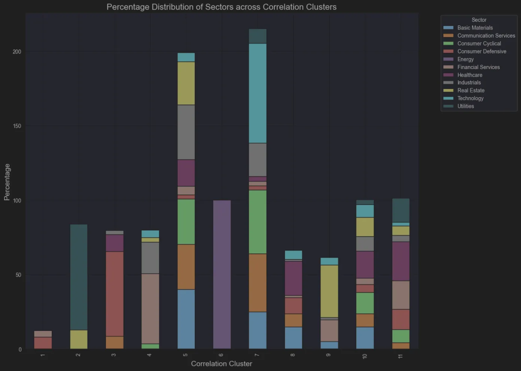
Let’s discuss this bar chart:
- Energy stocks are one cluster, indicating that this is a highly distinctive sector that moves together!
- Most Utility stocks in group 2 are from the Regular Electric industry, highlighting its distinct behavior within the sector.
- All the Mega stocks are in Group 7, except Berkshire, which is in Group 9. Nearly all technology stocks are also in Group 7, underscoring tech’s dominant role in the market.demonstrating that technology is the primary driver of the market.
What to do next
In the scope of this post, it is not so easy to examine all the possibilities of the clustering method. However, with some minor changes (or a bit more) of the above code, you can experiment and find insightful information that will guide you towards your personal trading edge:
- Add more features: dividend yield, debt/equity, revenue growth.
- Use technical indicators: RSI, MACD, moving averages.
- Incorporate alternative data: news sentiment, ESG scores.
- Apply clustering to rolling time windows.
- Build cluster-based stock screeners.
- Set up alerts for cluster composition changes.
- Automate clustering pipeline with scheduled updates.
Thanks for reading!