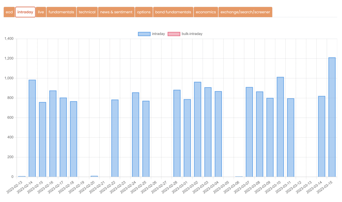
We are thrilled to announce the latest addition to our financial data services: API Usage Charts. This powerful new feature is designed to provide you with an elevated level of understanding and control over your API usage data. By offering daily aggregation and custom period functionality, charts deliver unparalleled insights, enabling you to make more informed decisions regarding your API consumption and overall business strategy.

Key Features
Our new daily aggregation feature provides a detailed overview of your API usage on a day-to-day basis. This granular view enables you to:
- Identify usage patterns and trends, helping you optimize your API consumption and avoid potential bottlenecks.
- Monitor the efficiency of your API calls, ensuring that you are making the most of your available resources.
- Detect anomalies in your API usage, allowing you to address potential issues before they escalate.
How to Access Advanced Charts for API Usage
To get started with Advanced Charts for API Usage, simply follow these steps:
- Log in to your account on our platform.
- Click on the “API Usage Details” button in the dashboard.
- Choose your desired API endpoint and period.
Conclusion
By granting you greater visibility and control over your API consumption, we hope to empower you to make more informed decisions that drive the success of your activity.
As always, we value your feedback and encourage you to reach out to our support team with any questions or suggestions. We look forward to continuing to enhance and expand our service offerings to meet your evolving needs.