

Dividends are profits paid out to shareholders, reflecting a company’s ability to generate cash and its payout approach. For investors, dividends provide income, potential tax benefits, and a glimpse into financial health. While not guaranteed, steady or growing dividends can enhance total returns and reduce volatility in tough market environments.
Dividends basics
Companies distribute dividends to share profits and demonstrate financial stability. A small dividend doesn’t always imply weakness—take NVIDIA as an example, focusing on reinvesting earnings to fuel growth while offering shareholders modest returns. Dividends may be paid out as cash, shares, or special one-time payments. For regular investors, factors like consistency, payout ratio, and sustainability matter more than just the dividend size or yield.
The process of declaring a dividend involves a clear sequence that ensures fairness and transparency for shareholders. When a company decides to distribute profits, it must publicly announce key dates indicating who qualifies to receive the dividend. These milestones help investors plan accordingly and avoid missing out on payments.
- Declaration Date: The date when the company announces the dividend amount, payment date, and other relevant details.
- Ex-Dividend Date: The date on which investors must own the stock to qualify for the dividend; purchasing on or after this date disqualifies them.
- Record Date: The date on which the company identifies which shareholders qualify for the dividend.
- Payment Date: The date on which dividends are paid to eligible shareholders.
What to check
When evaluating dividend stocks, focus on reliability and growth prospects rather than just high yields. Two important ratios assist in determining if a company’s dividends are sustainable and equitable for investors.
- Dividend Yield: This is computed by dividing the annual dividends per share by the share price. For instance, if a stock pays €2 annually and is priced at €50, the yield amounts to 4%.
- Dividend Payout Ratio: Indicates the portion of earnings distributed as dividends. A company with a 40% payout ratio retains the remaining earnings for reinvestment, maintaining a balanced approach between growth and shareholder returns.
In general, consistent yields and moderate payout ratios suggest careful management and sustainable dividend practices.
Investing Strategies with Dividends
Dividend investors can employ various proven approaches to achieve income, growth, or total returns while controlling risk.
High-Yield Dividend Investing focuses on selecting stocks with above-average yields, typically around 4–6%, from stable sectors such as utilities or REITs. This approach emphasises generating current income but requires caution to avoid investments with unsustainable payouts that could indicate financial trouble.
Dividend Growth Investing targets companies with a history of increasing dividends each year, such as Dividend Aristocrats like Procter & Gamble. It prioritises long-term growth through compounding rather than focusing solely on immediate income.
Dividend Income Investing involves constructing portfolios that generate consistent cash flow, typically through ETFs or blue-chip stocks. It is ideal for retirees seeking a dependable quarterly income to support their living costs.
Dividend Capture involves purchasing shares before the ex-dividend date and selling them shortly after to receive the dividend payout. It is a short-term strategy that relies on high trading volume to offset transaction costs and potential price declines.
Tax rules differ depending on the jurisdiction. Typically, qualified dividends are taxed at lower rates, whereas short-term trades such as capture strategies are taxed as ordinary income. More sophisticated options include sector diversification and advanced options-based capture strategies.
How can you do that?
Manually copying dividend data, sector performance, EPS trends, and payout ratios from websites is slow and can lead to mistakes or broken links. Using APIs like EODHD automates this process, providing accurate, real-time data quickly. This helps with effective backtesting, screening, and Python-based analysis, resulting in better dividend strategy decisions.
I will use EODHD APIs to analyse and address key questions: determining the best sectors for each strategy, identifying top dividend stocks, and verifying whether a company provides consistent or increasing dividends.
Let’s code
Using the EODHD API Stock Market Screener, I aim to retrieve as many stocks as possible for analysis. This API offers additional details such as last dividend, EPS, and market capitalisation, which should be sufficient for gaining some insights.
Since the API allows up to 1000 stocks with a limit of 100 per page, I will loop through the known sectors to fetch 1000 stocks from each.
import requests
import pandas as pd
import os
import json
from urllib.parse import quote

api_token = os.environ.get('EODHD_API_TOKEN')

limit = 100
all_data = []
sectors = ['Technology', 'Communication Services', 'Consumer Cyclical','Other', 'Financial Services', 'Healthcare', 'Consumer Defensive','Energy', 'Industrials', 'Basic Materials', 'Utilities', 'Real Estate', 'Financials']

for sector in sectors:
    print(sector)
    offset = 0
    while True:
        # Encode filters
        filter = [["market_capitalization", ">", 1000], ["exchange", "=", "us"],["sector","=",sector]]
        filters_json = json.dumps(filter)
        filters_encoded = quote(filters_json)
        # Build URL
        url = f'https://eodhd.com/api/screener?api_token={api_token}&sort=market_capitalization.desc&filters={filters_encoded}&limit={limit}&offset={offset}'
        print(f"Fetching offset {offset}...")

        response = requests.get(url)

        if response.status_code != 200:
            print(f"Error: {response.text}")
            break

        data = response.json()

        if not data:  # Empty response means no more results
            print("No more results.")
            break

        all_data.extend(data['data'])
        print(f"Retrieved {len(data)} records (total: {len(all_data)})")

        offset += limit


# Create DataFrame
df = pd.DataFrame(all_data)
I will also introduce a new column named MarketCapCategory to categorise stocks based on their market capitalisation levels: mega, large, mid, small, micro, and nano.
# Define the bins and labels for each capitalization category
bins = [0, 50_000_000, 300_000_000, 2_000_000_000, 10_000_000_000, 200_000_000_000, float('inf')]
labels = ['nano', 'micro', 'small', 'mid', 'large', 'mega']

# Create a new column with the categorized values
df['MarketCapCategory'] = pd.cut(df['market_capitalization'], bins=bins, labels=labels, right=False)
df['MarketCapCategory'].value_counts()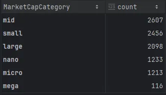
We have nearly 10,000 stocks available. However, a quick look at the dataframe reveals that many stocks have very low trading volumes. Consequently, I will exclude stocks with fewer than 999 shares traded on the last trading day.
df = df[df['avgvol_1d'] > 999]This brings our total to around 6,300 stocks, which should still yield meaningful results. Now, let’s analyse the average dividend across different market capitalisation categories.
import matplotlib.pyplot as plt

# Group and sort
avg_div_by_marketcap = (
    df.groupby("MarketCapCategory")["dividend_yield"]
      .mean()
      .sort_values()
)

plt.figure(figsize=(10, 6))

# Plot horizontal bar chart
ax = avg_div_by_marketcap.plot(kind="barh")

# Remove grid
ax.grid(False)

# Add value labels at the end of each bar
for i, (category, value) in enumerate(avg_div_by_marketcap.items()):
    # y coordinate is the bar index (i), x is the value
    ax.text(
        value,                # x position: end of bar
        i,                    # y position: bar index
        f"{value:.2f}%",      # label text
        va="center",
        ha="left",
        fontsize=9
    )

plt.xlabel("Average dividend (%)")
plt.ylabel("MarketCapCategory")
plt.title("Average dividend_pct per MarketCapCategory")
plt.tight_layout()
plt.show()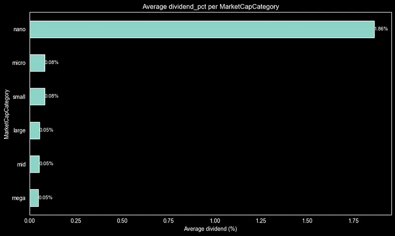
The bar chart reveals a distinct trend: nano-cap stocks have an average dividend yield of roughly 1.6% across all market-cap categories. In contrast, micro-, small-, large-, mid-, and mega-cap stocks generally exhibit yields near 0%. This suggests that nano-caps tend to distribute earnings more actively to attract investors, while larger companies often retain cash for growth, R&D, or acquisitions. This pattern is consistent with lifecycle theory, which states that mature firms favour reinvestment over dividends.
By making small adjustments to the code above, we can plot the same bar chart for the sector.
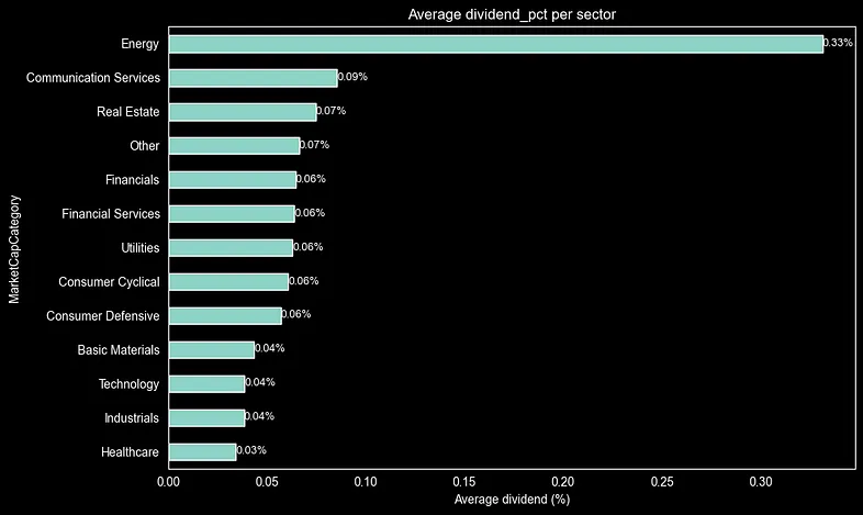
The sector analysis shows that Energy has the highest average dividend yield at about 0.29%, with Communication Services close behind at 0.27%, and Real Estate at roughly 0.25%. Defensive sectors like Utilities and Financials also perform well, while Technology and Healthcare lag at 0.10% or lower. This trend suggests that mature, cash-rich industries prioritise dividends over growth via tech reinvestment.
Let’s now test the code below to find the top 10 stocks with the highest dividend yields. We’ll start by considering companies that are less likely to have high yields, such as large technology firms.
df_copy = df.copy()
df_copy = df_copy.query("sector == 'Technology' and MarketCapCategory == 'mega'")

top10 = (
    df_copy.groupby('code')
    .agg({
        'name': 'first',
        'dividend_yield': 'mean',
        'sector': 'first',
        'MarketCapCategory': 'first'
    })
    .round({'dividend_pct': 2})
    .sort_values('dividend_yield', ascending=False)
    .head(10)
    .reset_index()
)

top10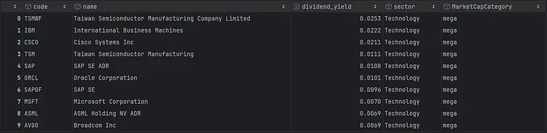
Someone interested in dividend strategies recognizes IBM as a top option. As demonstrated, it holds the second position with a dividend yield of nearly 2.3%.
How to avoid traps
Another useful analysis is detecting dividend traps—companies that pay dividends close to or exceeding their earnings to attract investors. We will add a payout_proxy column (using just one line of code) that shows the proportion of earnings paid out as dividends.
df['payout_proxy'] = (df['dividend_yield'] * df['adjusted_close']) / df['earnings_share']Next, we can filter our dataframe to select stocks that have positive earnings and a payout ratio under 80%, since these stocks retain earnings for growth.
df.query("earnings_share > 0 and payout_proxy < 0.75")Now, let’s review the payouts of the top 10 companies by market cap.
df[df['dividend_yield'].notna()][
    ['code', 'name', 'dividend_yield', 'sector', 'payout_proxy', 'market_capitalization']].sort_values(
    'market_capitalization',
    ascending=False).head(10)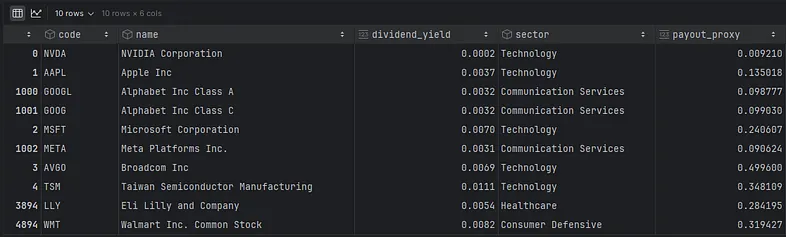
The list shows NVIDIA has the smallest payout, keeping its earnings for growth. While this suggests it’s not ideal for a dividend strategy, it reflects the company’s focus on reinvesting profits to drive growth, which partly explains its impressive stock returns in recent years. Conversely, Microsoft distributes a significant share of its earnings as dividends, making it a good option for investors seeking dividend income.
The most useful plot
Lastly, I will share the code that plots a stock’s dividend consistency over time by comparing annual dividends per share with adjusted stock price trends, highlighting stability and growth patterns. I will use EODHD APIs for historical dividend and price data.
The example below illustrates how the code fetches IBM’s historical dividends and daily OHLC prices from EODHD APIs. It processes the data with adjusted values for accuracy, resamples dividends annually, and constructs a dual-axis plot. This visualisation shows dividend per share trends (blue line with a linear fit indicating CAGR) alongside adjusted close prices (orange), highlighting the consistency and growth patterns over time.
code = 'IBM.US'
# get dividends
url = f'https://eodhd.com/api/div/{code}'
query = {'api_token': api_token, "fmt": "json"}
data = requests.get(url, params=query).json()
df_stock = pd.DataFrame(data)

# get OHLC daily prices
url = f'https://eodhd.com/api/eod/{code}'
query = {'api_token': api_token, "fmt": "json"}
data = requests.get(url, params=query).json()
df_price = pd.DataFrame(data)

# Process dividends (use 'value' - adjusted for splits/dividends, more accurate for historical comparison)
df_dividends = df_stock[['date', 'value']].copy()
df_dividends['date'] = pd.to_datetime(df_dividends['date'])
df_dividends = df_dividends.sort_values('date')

# Process prices (use 'adjusted_close' - reflects splits/dividends, aligns perfectly with dividend 'value')
df_price['date'] = pd.to_datetime(df_price['date'])
df_price_recent = df_price[df_price['date'] >= df_dividends['date'].min()]

# Resample dividends to annual for clarity (forward-fill last payment)
df_dividends.set_index('date', inplace=True)
annual_div = df_dividends['value'].resample('Y').last().dropna()

# Dual-axis plot
fig, ax1 = plt.subplots(figsize=(14, 8))

# Primary: Dividend per share (blue line + markers)
ax1.plot(annual_div.index, annual_div.values, 'bo-', linewidth=3, markersize=8, label='Annual DPS')
ax1.set_xlabel('Year')
ax1.set_ylabel('Dividend per Share ($)', color='blue', fontsize=12)
ax1.tick_params(axis='y', labelcolor='blue')
ax1.grid(True, alpha=0.3)

# Secondary: Adjusted close price (orange dashed)
ax2 = ax1.twinx()
ax2.plot(df_price_recent['date'], df_price_recent['adjusted_close'], 'orange',
         alpha=0.7, linewidth=2, label='Adjusted Close')
ax2.set_ylabel('Adjusted Close Price ($)', color='orange', fontsize=12)
ax2.tick_params(axis='y', labelcolor='orange')

# Trendline for DPS consistency (linear fit)
z = np.polyfit(range(len(annual_div)), annual_div.values, 1)
p = np.poly1d(z)
ax1.plot(annual_div.index, p(range(len(annual_div))), 'b--', alpha=0.8, linewidth=2,
         label=f'DPS Trend (CAGR: {z[0]*100:.1f}%/yr)')

plt.title(f'{code} Dividend Consistency: DPS vs Adjusted Price [file:50]', fontsize=14, pad=20)
fig.legend(loc='upper left', bbox_to_anchor=(0.02, 0.98))
plt.tight_layout()
plt.show()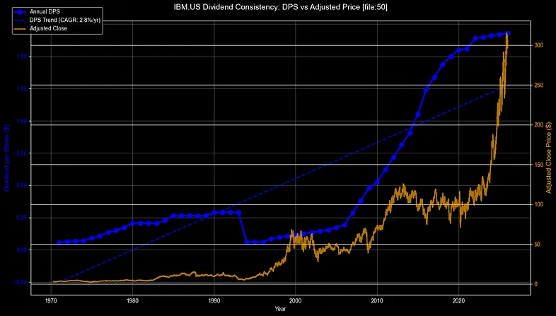
Since the 1960s, IBM’s dividend history shows impressive consistency, with DPS (dividend per share) consistently increasing from around £0.50 to over £6.50 (indicated by the blue line/markers). The growth follows a linear pattern with a CAGR of approximately 3.2%. Despite market fluctuations, dividends have not been reduced, even during downturns, highlighting IBM’s resilience. This steady increase solidifies IBM’s status as a traditional dividend aristocrat.
Now, let’s do the same for Microsoft.
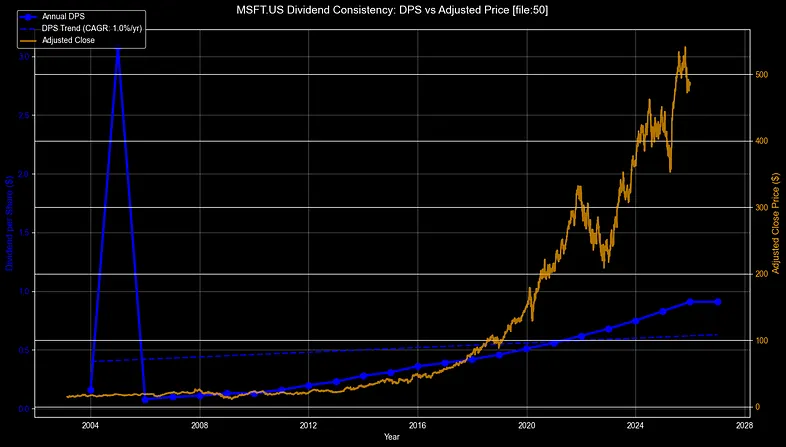
Microsoft (MSFT) has shown remarkable dividend growth since 2003, with DPS increasing from around $0.30 to over $3 (blue line), maintaining roughly 10% CAGR through consistent growth. After 2014, the stock price (orange) jumped notably, outpacing dividend growth and reflecting successful reinvestments. With no dividend cuts and faster growth, MSFT emerges as a top dividend growth stock, not just a steady payer.
Now let’s see what General Electric will look like.
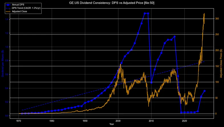
GE exemplifies a classic case of dividend failure. Its steady DPS growth in the 2000s (around 4–5% CAGR, blue line) abruptly ended with approximately a 90% dividend reduction in 2018, significantly breaking the trendline. While the stock price has rebounded (orange), the dividend remains low, signalling risks related to overexpansion and debt. Investors should be cautious with stocks that display broken upward trends.
Final thoughts
Dividends provide steady income streams and the potential for compounding growth for patient investors, but pursuing high yields alone can lead to pitfalls. Concentrate on payout ratios below 75%, consistent growth trends shown by CAGR lines, and sector diversification across energy, utilities, and financials. Automated tools like EODHD APIs eliminate manual data collection, enabling rapid screening of 10,000+ stocks by market cap, volume, and earnings coverage for truly sustainable opportunities.
Thank you for reading!