Plot buy and sell trading signals in Python’s graph
I’m going to assume you know the basics of technical analysis in trading. If this is all new to you, I recommend a great resource called Investopedia.
If you want to learn how to install the EODHD APIs Python Financial Official Library and activate your API key, I recommend to start with exploring of our Documentation for it.
Let’s take a basic example…
We want to determine when would be a good time to buy or sell our stock or cryptocurrency, but how can we do this? One way is to use moving averages to determine the direction of a market.
A Simple Moving Avergage (SMA) is when we take an average of the last n closing prices of historical trading data. If we are looking at the daily chart, each candlestick or data point will be 1 day. The SMA50 will be an average of the last 50 days of closing prices. This alone does not do much for us, aside from smoothing out the “noise” in a market. Where this gets interesting is when you compare it with another moving average, for example SMA200. Every time the SMA50 crosses above the SMA200 we know that the market is in an upward trend, and when the SMA50 crosses below the SMA200 it is a downward trend. You can use any moving averages you like but this combination is considered special. When the SMA50 crosses above the SMA200 it’s known as the “Golden Cross”, and when the SMA50 crosses below the SMA200 it is known as the “Death Cross”. When this event occurs it usually is followed by a strong price movement.
What we will need to start visualising trading signals in Python?
I’m going to use a Jupyter notebook in Google Colab. It’s free and easy to use if you want to follow along. I’m also going to use the EODHD APIs end-of-day demo key to demonstrate this.
The first step is we need to import our libraries.
import json
import requests
import pandas as pd
import matplotlib.pyplot as plt
We then want to retrieve the daily data for Apple’s stock (AAPL) and store it in a Pandas dataframe.
resp = requests.get("https://eodhistoricaldata.com/api/eod/AAPL?api_token=demo&fmt=json")
json_data = json.loads(resp.content)
df = pd.DataFrame(json_data)
df
If all has gone to plan so far it should look like this.
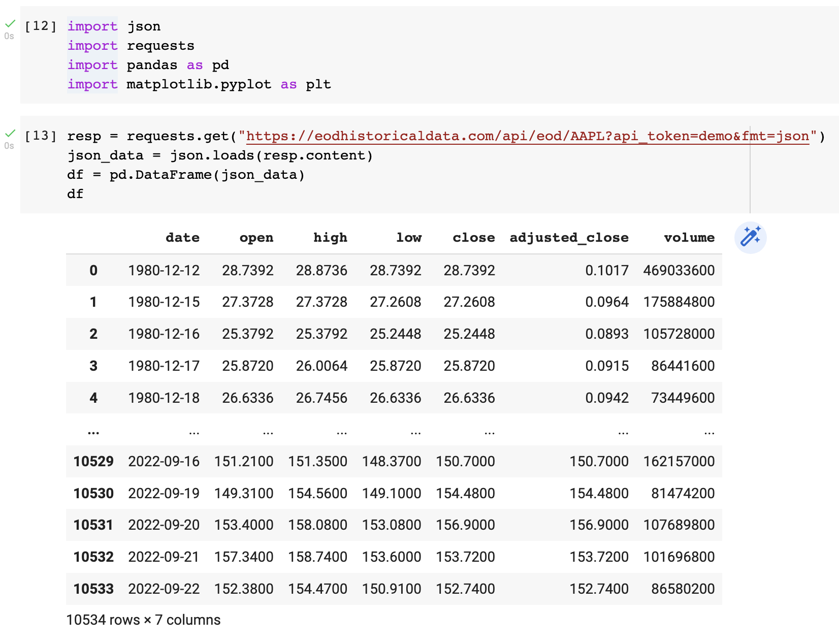
10534 days of Apple data!
“close” and “adjusted_close” are very similar, but I’m not going to get into the difference now, we’ll use “close” for this tutorial.
We want to add our SMA50 and SMA200 now.
df["sma50"] = df.close.rolling(50, min_periods=50).mean()
df["sma200"] = df.close.rolling(200, min_periods=200).mean()
df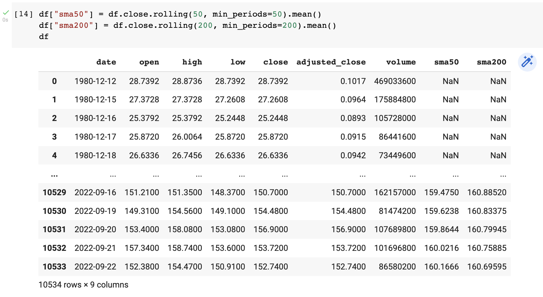
You will see our two new features/columns called “sma50” and “sma200”. You may wonder what “NaN” means. This means “Not a Number”, and you get this because in order to calculate the SMA50 for example, you need at least 50 data points to calculate the first point.
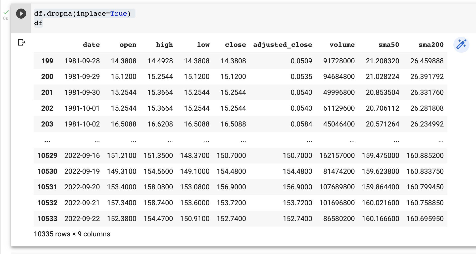
We have two ways we could deal with this. We could either replace the “NaN” with something else, like the closing price, or we could just drop those rows. As we have a ridiculous amount of data already, missing the first 200 rows will have no impact at all.
df.dropna(inplace=True)
df
And they are gone…
What does this look like graphed?
For the next step, well use a library called Matplotlib. It’s used heavily in Data Science for plotting data (you will notice we imported it earlier).
plt.figure(figsize=(30,10))
plt.plot(df["close"], color="black", label="Price")
plt.plot(df["sma50"], color="blue", label="SMA50")
plt.plot(df["sma200"], color="green", label="SMA200")
plt.ylabel("Price")
plt.xticks(rotation=90)
plt.title("APPL Daily SMA50/SMA200")
plt.legend()
plt.show()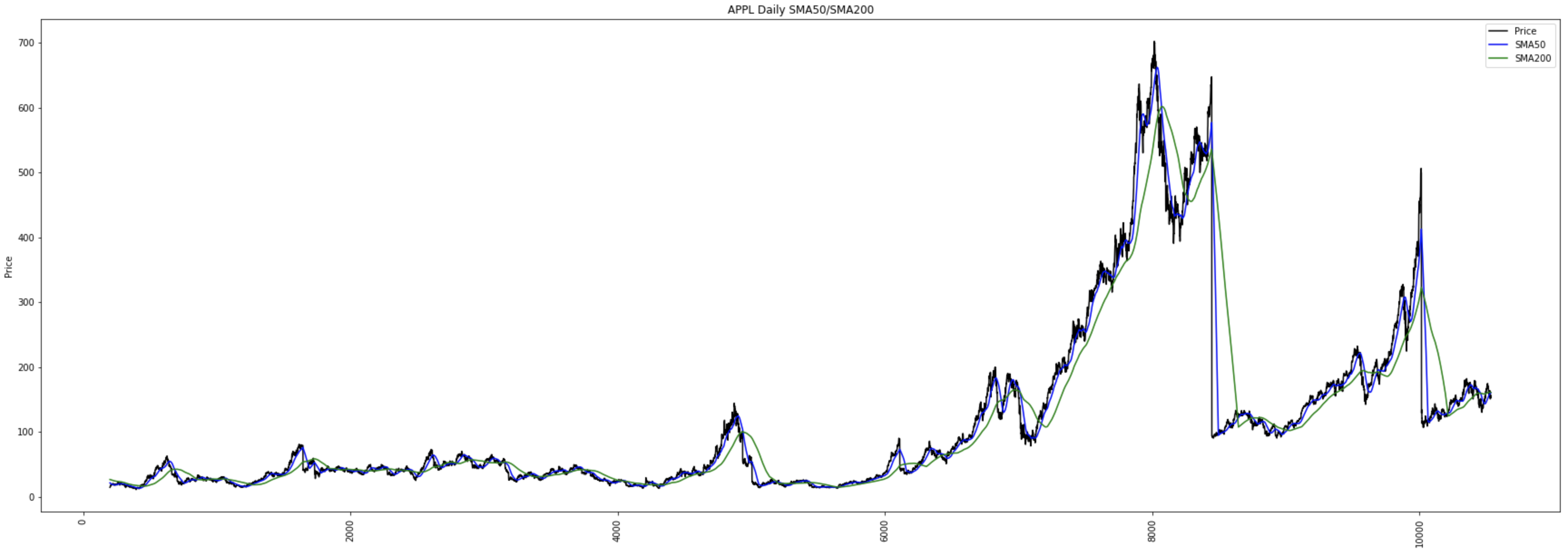
It worked, but it’s not easy to see. We are viewing over 28 years of data after all. This is way too much for what we need, so I will reduce this to the last year of data.
df = df.tail(365)And this is what it looks like now…
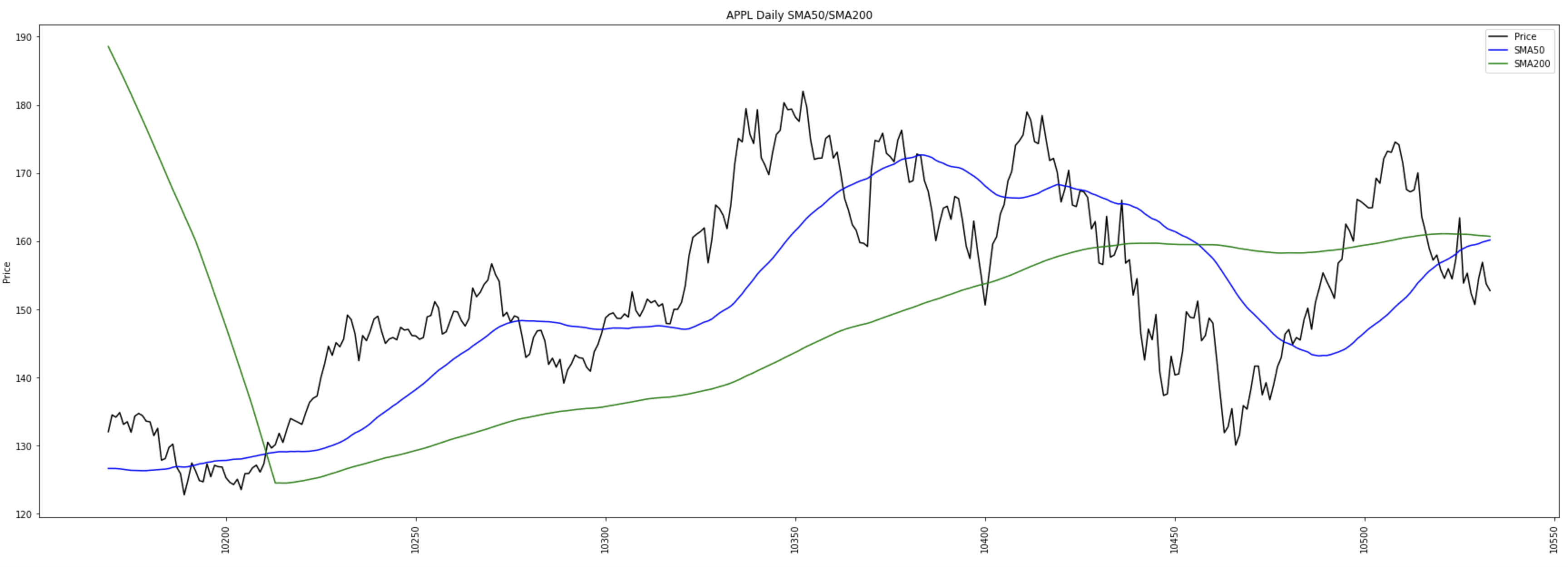
You will probably notice something that isn’t ideal. The x-axis ticks are index numbers instead of the actual date. It’s not a problem per se, but just isn’t all that nice. I’m going to replace the x-axis ticks with the actual date.
df.set_index(['date'], inplace=True)
df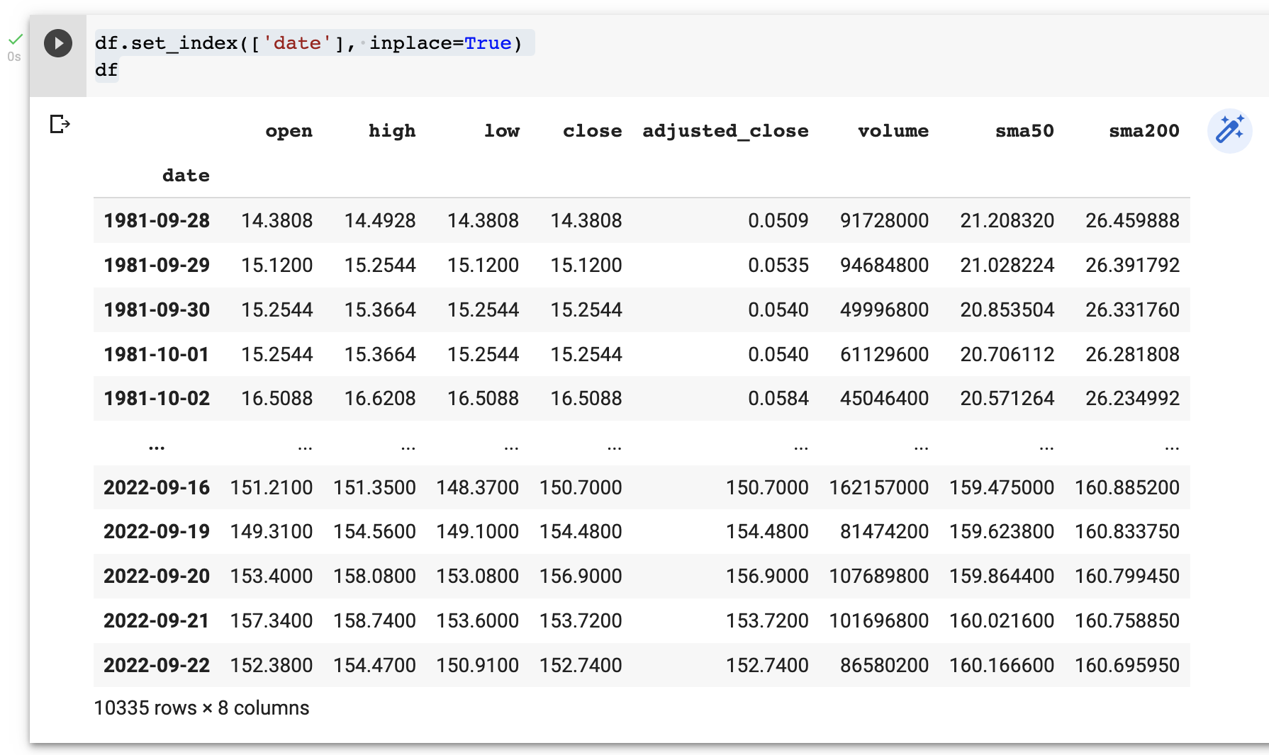
And it looks like this now…
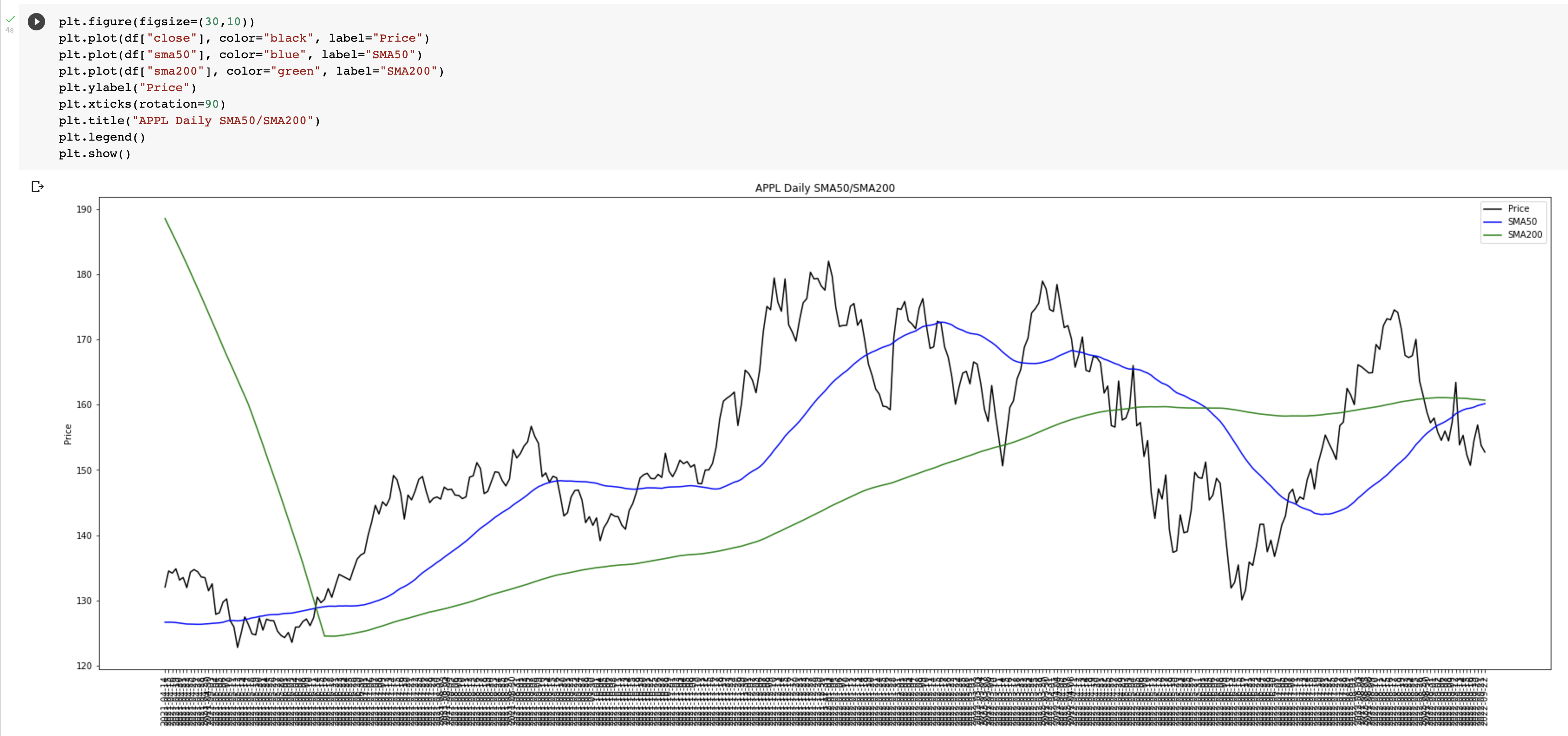
The next problem now is we have all 365 days on the x-axis, so a complete mess. But don’t fret, we can easily fix this. Well “easily”, it took me a while to figure this out.
The code we will need is as follows…
ax = plt.gca()
for index, label in enumerate(ax.xaxis.get_ticklabels()):
    if index % 7 != 0:
        label.set_visible(False)
What this is doing is saying is if the index number divided by 7 doesn’t equal 0, then don’t display it. Basically, show every 7th day.
The complete code looks like this….
plt.figure(figsize=(30,10))
plt.plot(df["close"], color="black", label="Price")
plt.plot(df["sma50"], color="blue", label="SMA50")
plt.plot(df["sma200"], color="green", label="SMA200")
plt.ylabel("Price")
plt.xticks(rotation=90)
plt.title("APPL Daily SMA50/SMA200")
ax = plt.gca()
for index, label in enumerate(ax.xaxis.get_ticklabels()):
  if index % 7 != 0:
    label.set_visible(False)
plt.legend()
plt.show()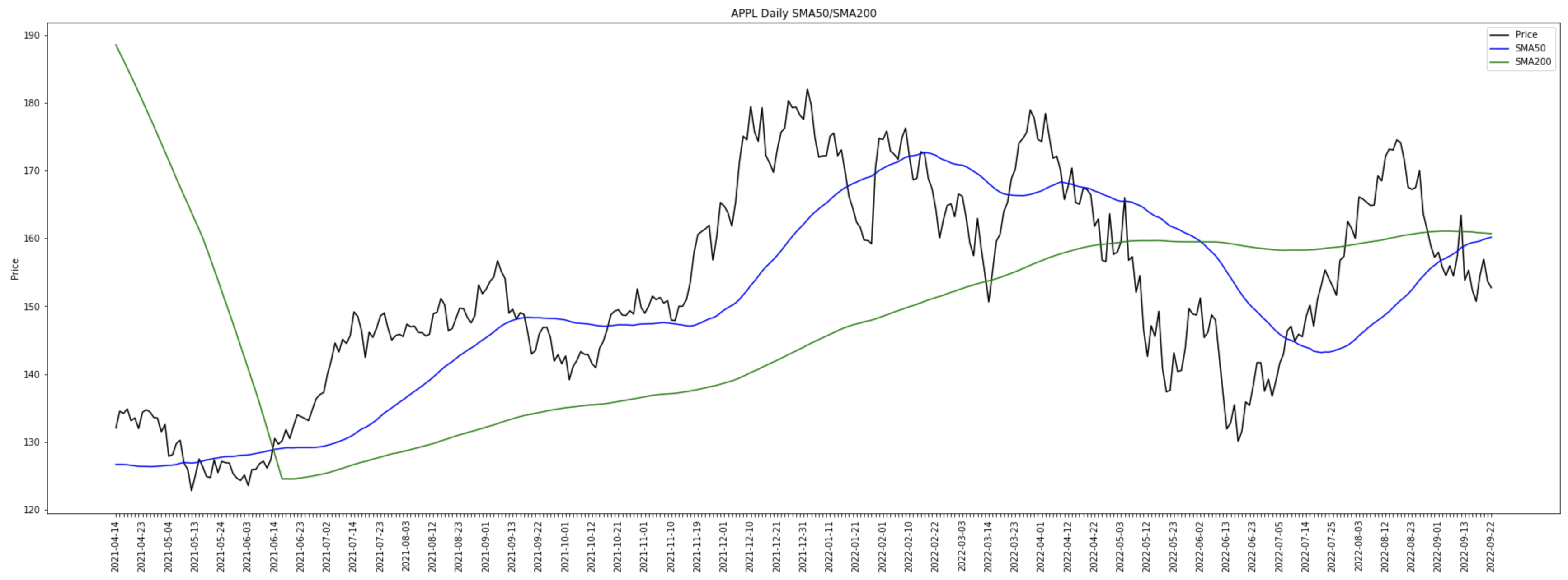
Nice!
In the graph you will see a black line, which is the closing price of each day. You will see a blue line which is the SMA50, and the green line which is the SMA200.
If you look at the first time (in the last year) the blue line crosses above the green line, you will see the market move into an upward trend. This would have been a great and profitable time to buy. Later, you see the blue line drop below the green line and the price dropped significantly. Ideally we would not want to wait so long before selling, but we can look into ways we can do this later.
While understanding the trading signals is crucial, the reliability of the data you use is equally important. Learn more:
Free vs Paid Stock Data: Which One Can You Trust?
How can we programmatically tell when the SMA’s cross over?
In Pandas, we can create a new feature/column with a boolean (true or false) entry based on a certain condition.
pd.options.mode.chained_assignment = None
df.loc[df["sma50"] > df["sma200"], "sma50gtsma200"] = True
df["sma50gtsma200"].fillna(False, inplace=True)
df.loc[df["sma50"] < df["sma200"], "sma50ltsma200"] = True
df["sma50ltsma200"].fillna(False, inplace=True)
df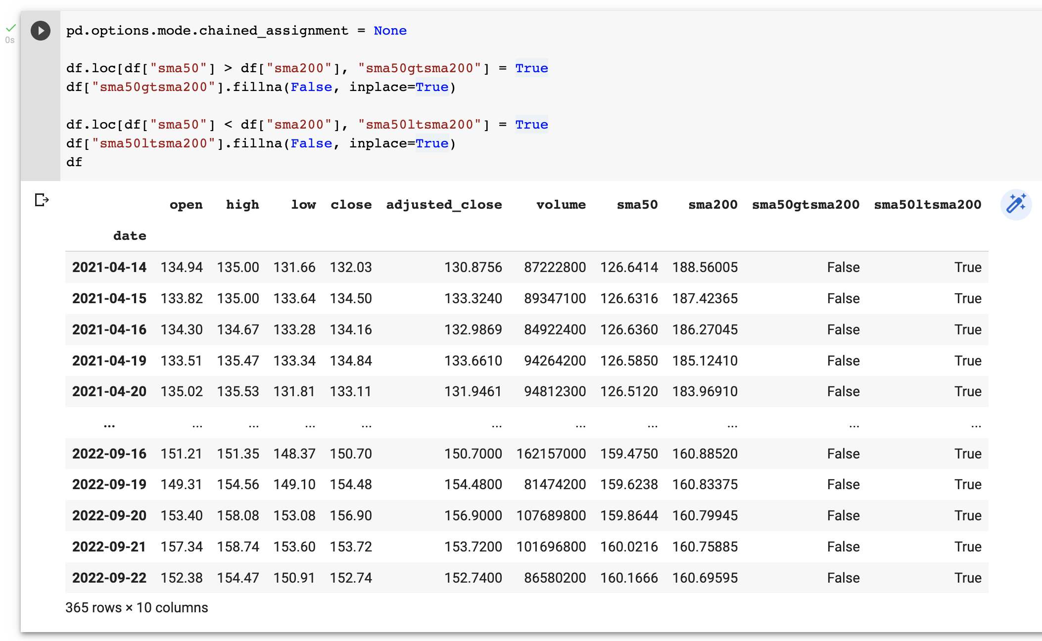
You will see our two new features/columns called “sma50gtsma200” and “sma50ltsma200”. The former returns True if the SMA50 is greater than the SMA200, and the latter returns True of the SMA50 is less than the SMA200. If it’s not True, then set to False.
What we want to do now is determine the point at when the cross-over occurs, and you can do it as follows.
df["sma50gtsma200co"] = df.sma50gtsma200.ne(df.sma50gtsma200.shift())
df.loc[df["sma50gtsma200"] == False, "sma50gtsma200co"] = False

df["sma50ltsma200co"] = df.sma50ltsma200.ne(df.sma50ltsma200.shift())
df.loc[df["sma50ltsma200"] == False, "sma50ltsma200co"] = False

df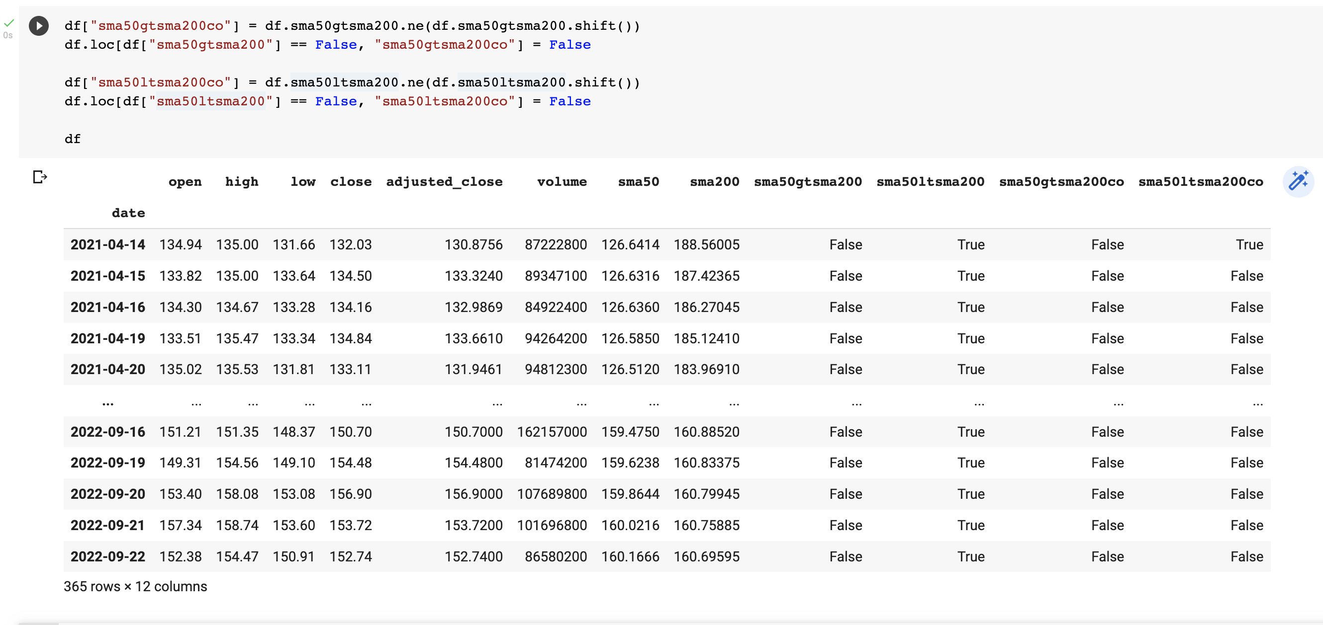
The two new features columns, “sma50gtsma200co” and “sma50ltsma200co”, will show when they cross over. We can confirm this as follows.
The buy signal(s)…
buysignals = df[df["sma50gtsma200co"] == True]
buysignals
And the sell signal(s)…
sellsignals = df[df["sma50ltsma200co"] == True]
sellsignals
Plotting our buy and sell trading signals in Python
The next step is we want to plot our buy and sell trading signals on the graph in Python. We can do it as follows…
for idx in buysignals.index.tolist():
  plt.plot(
      idx,
      df.loc[idx]["close"],
      "g*",
      markersize=25
  )

for idx in sellsignals.index.tolist():
  plt.plot(
      idx,
      df.loc[idx]["close"],
      "r*",
      markersize=25
  )
What this will do is plot a green star for the entries in the “buysignals” dataframe, and a red star for the entries in the “sellsignals” dataframe. It’s worth pointing out it will plot all the buy and sell trading signals in the Python’s dataframes so you can combine signals to get more advanced results.
The full code looks like this…
plt.figure(figsize=(30,10))
plt.plot(df["close"], color="black", label="Price")
plt.plot(df["sma50"], color="blue", label="SMA50")
plt.plot(df["sma200"], color="green", label="SMA200")
plt.ylabel("Price")
plt.xticks(rotation=90)
plt.title("APPL Daily SMA50/SMA200")
for idx in buysignals.index.tolist():
  plt.plot(
      idx,
      df.loc[idx]["close"],
      "g*",
      markersize=25
  )

for idx in sellsignals.index.tolist():
  plt.plot(
      idx,
      df.loc[idx]["close"],
      "r*",
      markersize=25
  )

ax = plt.gca()
for index, label in enumerate(ax.xaxis.get_ticklabels()):
  if index % 7 != 0:
    label.set_visible(False)
plt.legend()
plt.show()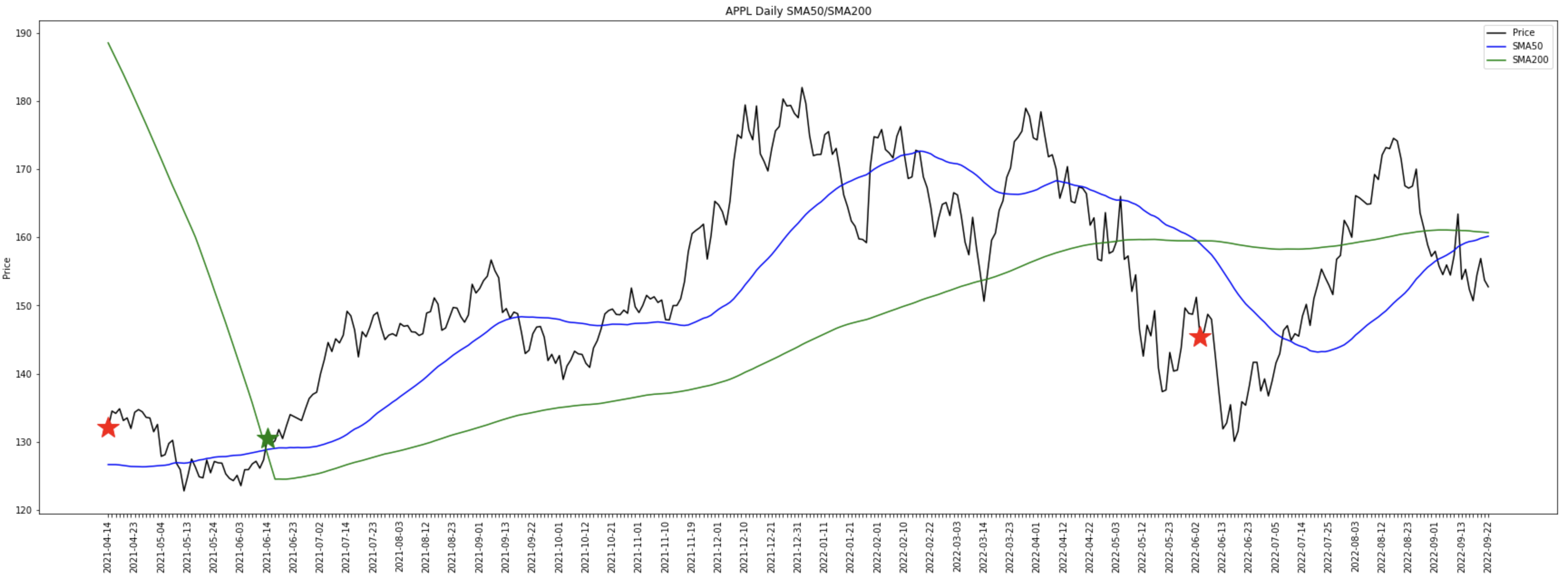
What is nice about plotting the buy and sell trading signals in Python is it allows is to see visually what is happening, but it also allows us to fine tune our strategies.
I mean I would be happy with the buy signal above but the following sell signal is late due to the moving averages lag.
Let’s try and add Moving Average Convergence Divergence (MACD) to it and see if it helps.
df["ema12"] = df["close"].ewm(span=12, adjust=False).mean()
df["ema26"] = df["close"].ewm(span=26, adjust=False).mean()

df["macd"] = df["ema12"] - df["ema26"]
df["signal"] = df["macd"].ewm(span=9, adjust=False).mean()

df.loc[df["macd"] > df["signal"], "macdgtsignal"] = True
df["macdgtsignal"].fillna(False, inplace=True)

df.loc[df["macd"] < df["signal"], "macdltsignal"] = True
df["macdltsignal"].fillna(False, inplace=True)

df
You can read up about the MACD technical indicator on Investopedia, but in summary, the MACD is calculated by subtracting the EMA26 from the EMA12. EMA is another type of moving average called an Exponential Moving Average. The Signal is the Exponential Moving Average using the last 9 MACD entries.
A buy signal is determined when the MACD crosses above the Signal and a sell signal is the reverse. We then follow the same process as before by adding in our additional feature/columns to identify when this happens exactly.
What we can do now is combine our SMA50/200 and MACD/Signal into composite buy and sell trading signals
buysignals = df[(df["sma50gtsma200co"] == 1) & (df["macdgtsignal"] == 1)]

sellsignals = df[(df["sma50ltsma200co"] == 1) & (df["macdltsignal"] == 1)]
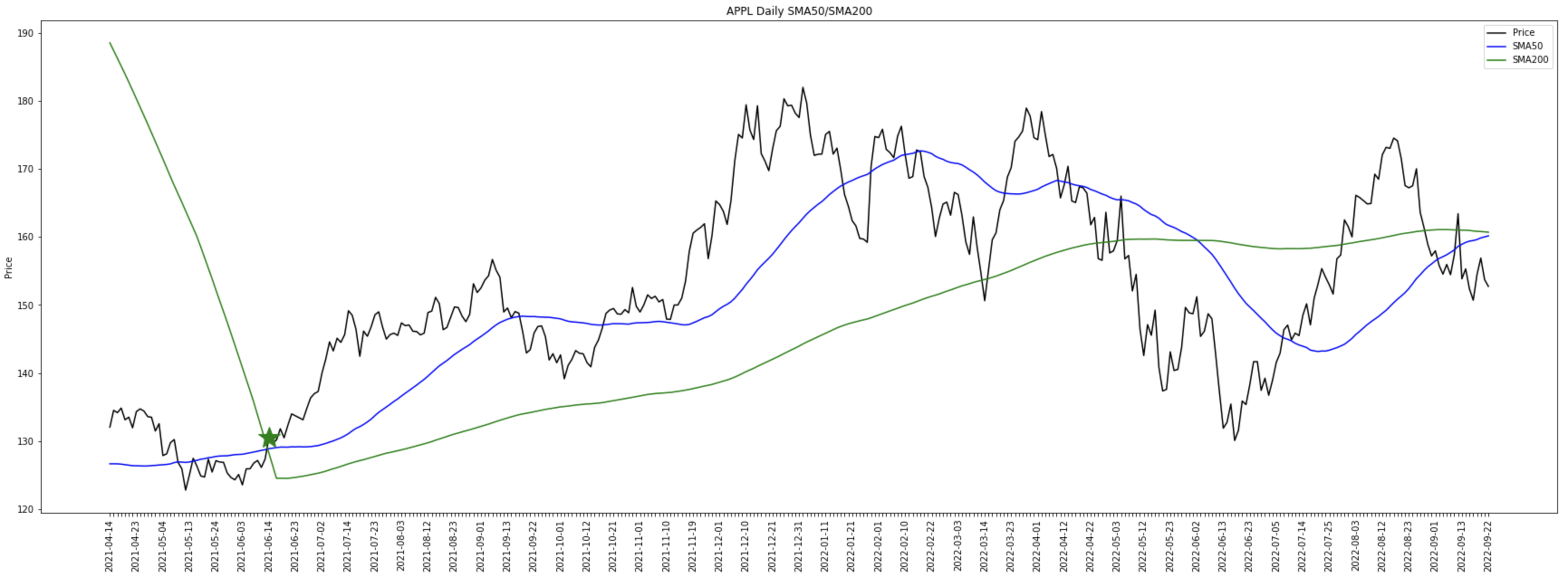
This is saying a buy signal is when the SMA50 crosses above the SMA200 and the MACD is greater than the Signal. A sell signal is when the SMA50 crosses below the the SMA200 and the MACD is less than the Signal.

You will notice it still thinks our buy signal is correct but our two sell signals have been removed. It may make sense not to sell and hold on, but I’m not entirely sure this is correct in this case.
What if we adjust our sell signal to say if the SMA50 is above the SMA200 and the MACD crosses below the Signal, what happens then?
df["macdgtsignalco"] = df.macdgtsignal.ne(df.macdgtsignal.shift())
df.loc[df["macdgtsignal"] == False, "macdgtsignalco"] = False

df["macdltsignalco"] = df.macdltsignal.ne(df.macdltsignal.shift())
df.loc[df["macdltsignal"] == False, "macdltsignalco"] = False

buysignals = df[(df["sma50gtsma200co"] == 1) & (df["macdgtsignal"] == 1)]

sellsignals = df[(df["sma50gtsma200"] == 1) & (df["macdltsignalco"] == 1)]
We now have 5 sell trading signals in our Python’s dataframe…

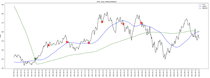
This looks a lot better now. Our buy signal looks good, and we have a number of sell signals to choose from. In fact even selling at that first sell signal after the buy with some leverage would be pretty decent.
This should give you an idea of what can be done and the tools to make it happen. You can experiment using all sorts of technical indicators and candlestick patterns to come up with your “magic strategy”.
Why don’t you try adding the Relative Strength Index (RSI) yourself. A buy signal is generally considered if the RSI14 is below 30 and a sell signal is considered if the RSI14 is above 70.
I will help get you started. The calculation for RSI is not as simple as the moving averages and MACD. It’s probably easier for you to use the “pandas_ta” library. I’ll get you started.
In Google Colab you will need to install the “pandas_ta” library using a dedicated code cell.
pip install pandas_taThe import the library…
import pandas_ta as taAnd then calculate the RSI14…
df["rsi14"] = ta.rsi(df["close"], length=14, fillna=50)The first 14 entries of RSI14 will be NaN. What I’m doing here with the “fillna” is to set the default value to 50.
I hope you found this article interesting and useful.

